You are currently browsing the category archive for the ‘printmaking’ category.
As I was tracing, my brilliant daughter asked me why I didn’t just print out the photo.
!?
Because then I could just sandwich carbon paper between the printed version and the linoleum in order to transfer it. No need to trace it and turn it over, as I’d planned.
?!
As long as I didn’t mind the image being reversed, my brilliant wife added.
!!
The printout is fine, and I don’t mind the image being reversed. I am set to show up tomorrow and transfer it to the lino. The tracing was fun and not difficult, but yeesh. It’s a good thing I have people around to point out the obvious.
The linocut class we signed up for as a family months ago is now one day away, and we’re all finishing up our drawings. Remember how my plan was a triptych showing three stages of seedpod decay? Well, I decided against seedpods for a few reasons. I couldn’t find the fresh seedpods; I didn’t document the decay as it happened; and frankly, I don’t find them much more visually interesting now than I did when they were closer to fresh. So I decided to print leaves: one freshly fallen, one more desiccated, and then one worn down to almost a skeleton.


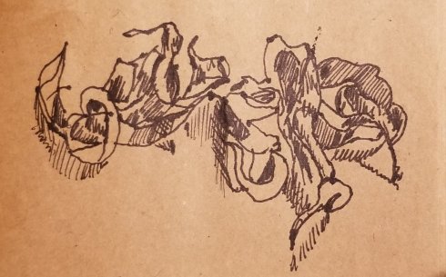
I collected and drew the leaves earlier this week, but when I did sketches of
the skeletal leaf, I realized that a print of it alone would take me the five hours of the workshop–at least. And it conveys the point without the earlier stages. So I am now working on tracing the version on the left from my computer screen onto tracing paper. (I’m holding the stem with a fishbone tweezer to keep my hand out of the shot.) I’m probably going to render it in black and white, no grayscale, so the print will look more like the version on the right.
Whether I can transfer the tracing to carbon paper and then onto the linoleum, carve it, and print it satisfactorily, all in five hours, is doubtful, but I’ll give it a go. I really want to work on the delicacy of my carving, and this fits the bill.
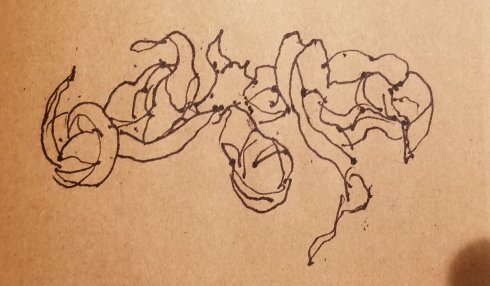
My wife got into the car on Sunday and passed me a handful of seed pods she had picked up on the sidewalk: different than the kind I drew in Sacramento over Thanksgiving, smaller and darker, though again I don’t know the species. “Here,” she said. “I know you like this kind of thing.” It’s so good to be known.
I put them in the well of the driver’s side door, and there they have been getting drier and rattling around. They’ve also given me an idea for the linocut workshop we’ll be taking from Katie Gilmartin at SOMArts in February. I want to have drawings ready when I go in, or I won’t get far on the print. I’m going to make a series (triptych, maybe) of these pods in various states, from fresh to freshly fallen to dried up. It’ll be a further exploration of something that’s interested me for a long time: the ambiguous nature of decay. “Decay” sounds like a judgment, as does “progress,” though one could use either word for what is happening. “Change” is a more neutral descriptor. That’s what fascinates me. Since they are growing more wrinkled and fragile, we would probably say that they are decaying, yet their beauty is not diminished. It is only different, and to some eyes, increased.
I don’t know how much they have really changed over the last five days. They might only rattle more now because they were damp when Joy picked them up, and now they’re dry. I have the impression that they’re more wizened and bent, but I can’t be certain because I didn’t look very closely at them on Sunday. I’ll know better when I go get some more and draw them at intervals.
For tonight, I just drew them as they are now, twice, quickly, in ink pen, as a first stage of getting to know them.
#100days
Black History Month, day 5
I love this picture book of the song that came to be known as the “African American national anthem,” “Lift Ev’ry Voice and Sing.” The words by James Weldon Johnson are thoughtfully, sometimes devastatingly paired with linocuts by the great printmaker and sculptor, Elizabeth Catlett.
I have not been able to find out how these pairings came about. The song came first (Catlett was born 15 years after it premiered, and the prints were made in 1945-6, when she was 30-31 years old, which, by the way, blows my mind) but did she make the prints specifically to accompany this song? Or did she choose them out of her oeuvre almost 50 years later? Or did an editor choose them? I’m curious, though ultimately it doesn’t matter. The words illuminate the art as much as the art illuminates the words.
Johnson and his brother, J. Rosamond Johnson, wrote the lyrics and music, respectively, for a Lincoln celebration in Jacksonville, Florida, where it s sunny by an enormous chorus of children. Thirty-five years later he wrote:
Shortly afterwards my brother and I moved from Jacksonville to New York, and the song passed out of our minds. But the school children of Jacksonville kept singing it, they went off to other schools and sang it, they became teachers and taught it to other children. Within twenty years it was being sung over the South and in some other parts of the country. Today, the song, popularly known as the Negro National Hymn, is quite generally used.
The lines of this song repay me in elation, almost of exquisite anguish, whenever I hear them sung by Negro children.
Elation/exquisite anguish. The lines of Catlett’s prints express this paradoxical combination just as the Johnsons ‘ song does. A beautiful book. (The music for piano and voice is printed in the book as well.)
Joy spotted a sign for an etching workshop here in Oaxaca (grabado en metal, in Spanish): three days, five hours a day, various techniques. Investigation confirmed that the artist, Marco Velasco, would gladly teach a ten-year-old how to work with acid, something not all printmaking workshops here have been willing to do, so all three of us signed up.
The germ of this piece came to me seven years ago; it even inspired me to begin learning GNU Gimp (open-source Photoshop) because I envisioned it as a digital collage. But I didn’t learn how to make digital collages (yet), and the piece sat in my sketchbook and a corner of my mind. When I learned about the variety of marks one can make with etching, it emerged and said “make me a print!”

Colony Collapse Disorder, etching, about 4″ x 8″, (c) Amy Zucker Morgenstern July 2017
It involved fun research. I did not know that the headache-medicine people, Bayer, own a company called Bayer CropScience, soon to acquire Monsanto. Nor that it is one of the biggest manufacturers of neonicotinoids, the pesticides that work by attacking insects’ neurological systems, and of course an ardent advocate of the claim that they have no significant effect on bees. Nor that Monsanto has decided to protect Bayer’s flank by producing a new kind of bee. (It’s the Roundup Ready corn of the insect world. Make poison, spread it on everything, and when you discover that it kills some species you like, instead of changing the poison or ceasing to spread it, alter the species.) Bayer’s logo even resembles the cross-hairs of a rifle, a pleasing bit of serendipity. I also did not anticipate that looking up images of the Gadsden flag, the one that says “Don’t Tread on Me,” would cause websites full of US flags and pugnacious political mottos to pop up in my ads, but of course it did.
I think the founding principles that united the American colonies left us particularly vulnerable to attacks like the one on the bees (and our food sources, and the entire web of plant and animal life), but these ideas are still too abstract for art; I don’t have the image yet to express what I think is threatening to cause the collapse of the human colonies. Maybe there will be future works in a series.
I know for certain that I want to do more etching. I loved the techniques. You can scratch into the varnish that will resist the acid, or use a different kind of varnish and draw right onto it (the smudges in the lower left come from my leaning on the plate as I did that, a mistake), or scratch into the plate itself. And make areas of darker and lighter tone by how long you leave the plate in the acid, and by gently sanding the plate’s surface. Unlike relief techniques like linocut, where you think in negative (what you want to be dark, you leave behind as you carve), the marks you make on an etching plate will be dark. This makes it possible to transfer images to the plate in my own drawing style. The three days involved painting, drawing, scratching, sanding–I enjoyed every minute.
I haven’t been posting most of the art I’ve been making, so over the next few days I’m going to post a piece per day.
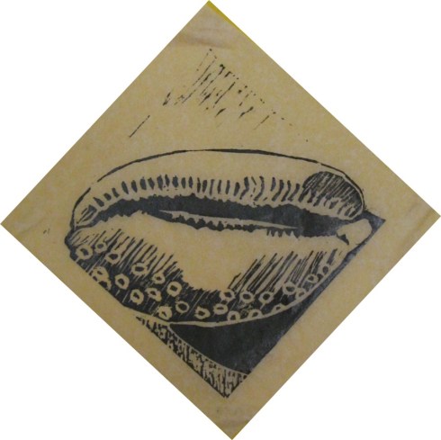
This is a linoprint, about 4 x 4 inches. I was in the studio we all go to together most weeks, Ishuakara (I finally found out the origin of the name; it means “rebirth” in the owner’s native Zapoteco), with extra time on my hands, and no particular idea for a print. Armando had a field guide to shells on his bookshelves, and since my daughter loves cowrie shells, I started in that section and zeroed in on this one, a measled cowrie. I’m going to frame one of the prints for a Christmas or Hanukah present for her (shhh).
It’s the second linoprint I’ve made. His methods are a bit different than those at Burro Press down the street. For example, rather than using a press, each was printed by hand, with the pressure applied with the back of a spoon. Nice to learn these different ways to do things.
Last Saturday we went to a workshop on barro negro (black clay) with an artist from San Bartolo de Coyotepec. Incredibly, the method is pure pinch pot: building it up with one’s hands, without coils (for the most part), slabs, or pottery wheel. I really liked the vase I made, but the bottom is much too thick and has developed cracks that would break it right apart in the firing. So I am going to dissolve it back into clay and start over–now that I’ve documented what it looks like.

Then, yesterday, we went to Burro Press and got a lesson in linocuts, called suelografía in Spanish, to my amusement–suelo means floor. Here’s the first proof of my first linocut, and the placa (what’s it called in English? plate?) below.

There are two changes I’ll make now that I can see how it’s come out, and one change I wish I could make but can’t. I will make the sky and the area around the door more purely white, and I wish I could change the cross-hatching on the left-hand building (left-hand in the print, that is, not the plate). I wanted it to look lighter in color than the building to its right, but I think it is too busy. If I had it to do over again, I would use the same technique of vertical white lines, but make them denser.
And I will have it to do over again, because I’m taking a class in woodcut and linocut at the Casa de la Cultura Oaxaqueña starting in two weeks. (I won’t really re-do this piece, though. I have other plans.)
Joy & Munchkin made beautiful pieces in both media, and we’ll be picking up their fired barro negro later today.


Distraction
December 11, 2016 in printmaking, social commentary | Leave a comment
A benefit of being in Mexico is that I don’t have my smartphone. My service wasn’t easily transferable to Mexico, and rather than sign up for something that would deliver data here, I just got a pay-as-you-go cheap phone with Telcel, a Mexican company. It lets me text and call, which is all I need, and frees me to look around and be more present. My smartphone is waiting out the six months in a drawer, but I recognize myself in the people all around who are doing this:
The only reason I’m not doing the same thing is that my phone doesn’t work.
I made the above piece under time pressure. I had to draw something for a lesson in silkscreening, since the project I had in mind didn’t fit the criteria of simple lines and three colors. So I drew what I’d been noticing, wincing a little at the preachiness of it. Silkscreening turned out to be fun and frustrating; of 30 prints, I didn’t get a single one that was in register (colors lined up properly) and lacked smudges and had a clear print of all three colors. Just the same, there is something very satisfying about lifting up the screen to see what the squeegee has accomplished.
Most of all I am glad I made this piece because it lodged a reproof firmly in my mind: the preachiness hit the mark it ought to, myself. When, last month, the munchkin and I spent a week in Maryland and Pennsylvania and I reactivated my phone, I remembered this just-finished print and managed to use the phone mostly for its important purposes–calling and GPS–and stay off it the rest of the time. But oh, the lure of Facebook! So much of what I’m seeking there is simply “We see you,” as Marc Maron says, in a statement illustrated devastatingly by Gavin Aung Than on Zen Pencils. It is a supremely ironic reason to ignore my friends and family. But the data access and other tools are very useful, so I’ll have to find a good site blocker when I’m back, to use them without giving in to addiction. And maybe I’ll post this print where I can see it often.
Share this: