You are currently browsing the tag archive for the ‘Diane Savona’ tag.
When Diane Savona said that she would make me a stole on commission for the 20th anniversary of my ordination, she asked, “What sort of images mean the most to you?”
Wow. Where do I start? Even more difficult, where do I stop? I started scribbling in my notebook, which is my way of breaking through Questions Too Big To Answer, and came up with this list:
Burning bush: this became an important image for me in the process of writing a sermon to be delivered to colleagues on one of the great challenges of this work: How to stay present to people at the most painful, intense moments of their lives, and not just shrivel up and float away on the breeze. The best I have come up with, then or since, is that there is something deeply invigorating about entering fully into such moments: that (as I said then) it is in the places of pain and risk that we find the strength and solace to withstand the brokenness of the world, and even be transformed for the better by it. And the burning bush is of course an image from my cradle religion, and was even, it occurs to me now, the logo of Conservative Judaism as I was growing up (or was it the Jewish Theological Seminary, the movement’s rabbinical school?), with the accompanying phrase in Hebrew and English: ” . . . and the bush was not consumed.”
Spirals: these are, essentially, my personal yin/yang, a reminder of balance, because of the way they combine two kinds of motion: forward motion (in the way they move outward, or in the case of a helix like in DNA, onward), and cyclical/repetitive motion (in the way they circle around). In a spiral, one comes around again and again to the same place, but not quite the same place. Which is how life is, I think. I try to communicate this kind of balance to the folks in my congregation: stillness and progress, tradition and change, being and becoming.
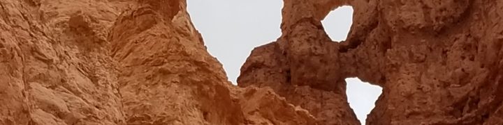
Decay/erosion: for several years now, as followers of this blog know, I’ve been drawing and photographing decay. Layers of walls in Oaxaca exposing hundreds, or even millions, of years of change; the patterns left by insects burrowing in wood; wrinkles on faces; etc. I find erosion very beautiful for the way it reveals time and history, and there’s a tension between that beauty and the way our culture (over)values youth and novelty. A big part of my ministry is helping people perceive the beauty in the ordinary or despised.

Sun, stone, seed (monoprint, 2018). The lack of centering comes from having to snap the photo of it while it’s attached to the stairway wall. 😉
Seeds/stones: I’m moved and intrigued by how closely many seeds resemble stones. There is so little difference between them, and all the difference in the world. And then there is the way seeds have to split open, essentially die in one form, in order to become more than a stone and actually grow. Whereas stones are just . . . nonliving. (No shade on stones. They’re pretty cool in their own right; note the title of my blog.) I don’t quite know what is so meaningful to me about this image of the seed in the act of sprouting, but it keeps popping up in my own work, as much as I cringe and worry that it is a cliché. There is something there about the way life and death are intertwined that keeps troubling and inspiring me, especially as I get older and try to come to terms with the reality that I am going to die. Also, an early and dear memory of mine is planting the family garden with my dad, and I always got to plant the beans, which are satisfyingly fast and visible in their process; you can often see the remnants of the seed still stuck to the first shoot as it emerges from the crack in the ground.
That’s what I told Diane, and after a bit of further dialogue between us, and many, many iterations that she worked through and recounted to some extent on her blog, she has now finished the design phase. She added so much. Mexico is in there now, and my wife and daughter, and the subtle suggestion of a rainbow, and the subtler suggestion of bees, and a water lily leaf (a.k.a. lotus–despite the fact that I never even got around to saying what was important to me about Buddhism), and roots finding their way through brick- and stonework to the sources of life. I’m so excited to see how it will be further transformed by her stitching.
Several months ago, I decided that in honor of the 20th anniversary of my ordination, which will be April 30, 2020, I was going to commission a stole. At first I looked at the websites of people who make stoles, which include many talented artists who make beautiful pieces. But I soon broadened my search, looking for fabric artists in general, which is a pretty wide net. So it was sheer luck that I happened upon the website of Diane Savona, whose work was so arresting that I put aside stole-related thoughts and just wandered happily through the gallery of her past pieces for a long time. Then I clicked on the link to follow her blog.
As I was to tell her when I finally reached out, not only is she a deeply thoughtful artist with consummate mastery of her craft, but the kinds of themes and issues she explores in her work resonate with many that are important to me. We share a fascination with the way the past is embedded in the present physically and psychically, with the beauty of objects that are obsolete or decaying, with certain objects such as keys and maps, and with art forms that are a mixture of found objects and new creation.
I don’t know whether she would describe her work as spiritual, but I see spiritual themes within it, such as her deeply respectful homage to places touched by tragedy (in the series Maps, which includes Hiroshima, post-Katrina New Orleans, and Japan after the 2011 tsunami). Her pieces in Soft Bodied Specimens and Fossil Garments show a knowledge of and respect for past wisdom, and in This Too Shall Pass she reflects on transience. And in “A Map of Hometown Perceptions” (another of the Maps series), she illuminates the racial segregation of her region in a way that is unflinching and also visually compelling, and that feels akin to my own activism.
I knew right away that I had found the artist I was looking for, but it took a couple of months before I got up the courage to write to her. It felt somehow presumptuous. “Hello, artist who is very busy developing her own ideas. I see you are working on an Opus” (that’s really what her current piece-in-progress is called! I like her sense of humor also) “but could you take a detour to work on a piece of clothing for a stranger?” I knew this fear was irrational, because artists do accept commissions, and if it’s not a good time or the commission doesn’t interest them, they will say no, and no harm done. Also irrational was my feeling that it was somehow degrading to ask an artist to make something for daily (well, weekly) use. She is, after all, a fabric artist, who has chosen a medium that, like pottery or weaving, is closely connected to pragmatic arts, in order to make works as complex and meaning-laded as any sculpture in marble or painting in oils. She is not likely to be offended by the idea that someone would wear one of her pieces.
So I took a deep breath and sent off my proposal. And she wrote back right away, intrigued, and by the time we’d exchanged a couple of e-mails we had arranged a commission. Not only that, but she could finish it by the anniversary, which was something I hadn’t hung a lot of hope on (I hadn’t even mentioned the date at first). And, best of all, she wanted to collaborate quite a lot, beginning by asking me what images were important to me, and then sharing many steps along the design path by checking in and asking what I liked. This is a tricky matter. It’s all very well to point at a design in progress and say “I like this better than that,” but to really know, I needed to know some of her thinking. Was there some significance to this seed or that photo of crumbling wall? She gives such careful thought to the many layers of meaning in images that I didn’t want to choose them only based on their visual impact, but to know their significance. That informed my choices.
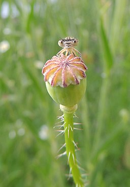
Damselfly on a poppy pod (Orangeaurochs from Sandy, Bedfordshire, United Kingdom [CC BY (https://creativecommons.org/licenses/by/2.0)%5D)
Some of the significances were serendipitous. For example, there was a skeletal seed pod in one design and, intrigued by its dramatic shape, I asked what plant it was from. It turned out to be a poppy, and poppies are our state flower. It’s a different genus than the California poppy–which is good, visually, because California poppies’ pods are long and thin, like elongated mini-okra, not as interesting a shape. But it has the same name as its cousin, poppy, and as someone who, somehow, has ended up spending the bulk of my career as a Californian, I like having it there. She wanted to make sure I didn’t mind the association with opium, but it’s fine.
And, speaking of opium, Diane proposed some walls of Oaxaca, sharing photos that she’d found on the internet, I guess, and one of them was very familiar to me. I wrote about it here; it’s an exterior church wall graffitied with the line from Marx, in Spanish, “Religion is the opium (opio) of the people,” and became a family joke immediately because of the first-glance similarity to “Religion is the celery (apio) of the people.” It turned out Diane hadn’t even taken note of the graffiti; she just liked the wall itself. So I asked her to incorporate it if she could, and she has. I don’t want the phrase on my stole, either with “opium” or “celery.” Marx is too down on religion for me, and certainly for a religious ritual item. But having a bit of that wall right at my back will be funny, and a reminder to myself that my purpose as a leader is always to use religion to wake people up, not put them to sleep.
So, you can tell part of what I responded when she asked what images are important to me, but this has gotten long enough, so I’ll say more about that in the next post.


Recent comments