You are currently browsing the monthly archive for January 2015.
I know why I chose this one among hundreds of drawings: because of how much it conveys with how little.
 The next one, though? I have no idea why I included it. Limbs as stiff and flat as if they’d been cut out of plywood. The middle finger is about the only thing I like. Give me the finger!
 Such a lovely gesture, and her hands seemed to be opened to the light that filled them like water. Next time, can I remember to just focus on the hands and leave the rest be?
 In this last one, that’s what I did.

All of these are about light, and take several different approaches to getting light to show up on paper. It is so hard for me to leave parts of the paper blank. I’m looking at this person’s skin, and it’s not white. I want to put shading everywhere. If I force myself to leave the lightest patches completely clear of charcoal, good things tend to happen. I got fussy with the many shades of gray in these next two, but the patches of pure white go a long way toward rescuing me from the cul-de-sac I was creating.

Make sure to include shadows where body touches floor; they make light visible.
Sometimes the light makes things invisible: the edge of a cheek, the detail of a bottom lip, are lost because the light falls on them so brightly.

This cracked me up: Why You Should Never, Ever Get a Tattoo (But Having a Baby is Fine). I particularly like #10:
“You think you’re going to seem so cool walking around with one, but really most of the time you’re going to look sort of ridiculous.”
Sorry, I couldn’t hear that last one. I was screaming the phrase, “DON’T EAT THOSE BUGS,” while pulling pieces of sweet potato and banana out of my hair and coat pockets.
About “you know it’s going to hurt, right?”: I was scared shitless about how much having a baby was going to hurt. But the thing about childbirth–and you can interpret this as a pro or a con–is there’s no going back, and there’s no stopping. Once I realized I was pregnant, I knew: there’s only one way out of this, and it’s gonna hurt. Ulp. And once labor started, I could cry and yell and raise a ruckus, but all anyone was going to do was give me some more fentanyl and squeeze my hand sympathetically. This is just as well, because if there had been an off switch, the Munchkin would still be inside, and attending second grade would be very complicated.
Whereas, if I went and got a tattoo, I know what would happen. I would scream and make the person with the needle stop after about ten minutes, because I could. I’d never have the courage to finish the job and it would look ridiculous, a badge of cowardice and incomplete art. I’d be like Bart Simpson, wearing MOTH on my arm for the rest of my life.
I’ll be joining 1000 Voices for Compassion, which currently stands at the mathematically-pleasing number of 1024 bloggers who will write about compassion on February 20. What do you think compassion is? What does it mean in your life?
The day I did this drawing, I knew it was some kind of breakthrough. It has to do with the cleanness of the edges of the shadows. I get really frustrated with myself when all my marks are mushy. These are not mushy. They’re almost Cubist in appearance in places, as happens when I work so much and so firmly with the long edge of the charcoal. But the shading on the belly is subtle without being wishy-washy. Something really good was happening here.
 Three weeks later, with lots of unsatisfying attempts in between, I managed to keep that same firmness. There are places where the edges are soft, maybe too soft, as in the left calf and foot. I’m not sure whether those work, but to the extent they do, it’s because not every mark on the page is like that. Most are more clearly delineated. This is a case of the first longer pose (seven minutes) maintaining some of the spontaneity and energy of the warmup one- and two-minutes.
 There’s usually one spot that grabs my attention, and without taking time to analyze why, I almost always start there. On the next drawing, done the same day as the previous one, it was the dramatic light on the right hand.
I have brown and sanguine conte crayons in the art box I bring to drawing, but I seldom get them out. This time I wanted some color, and wanted to try the different medium, which has a little more drag than charcoal; it’s stickier, smoother. This next drawing is a bit of a mess, but I like the gesture, and the left hand, which is far from an accurate rendering but conveys the energy of the pose; intense, intent on something inward, but braced for what’s outside.
 This next one is a more tranquil pose from the same day as the previous. Still working on the clarity of all those planes–there are so many on her belly, revealed by, and revealing, of the light. I like the light in this, overall.
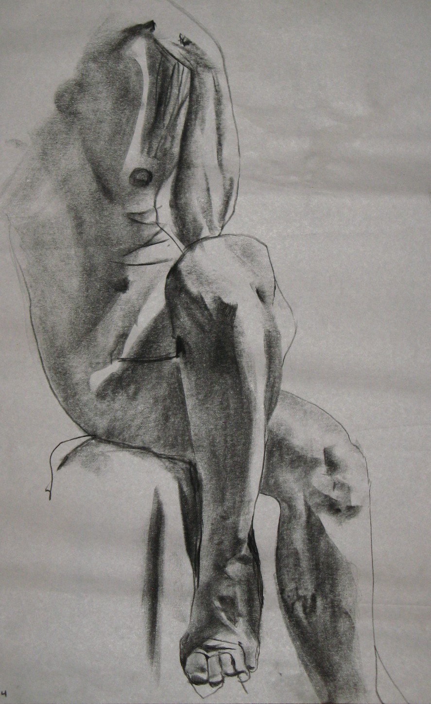
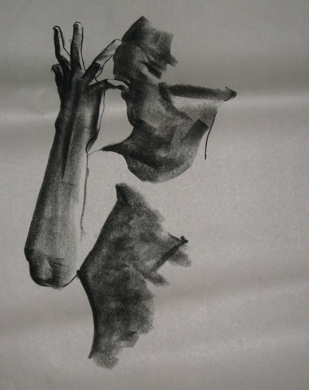
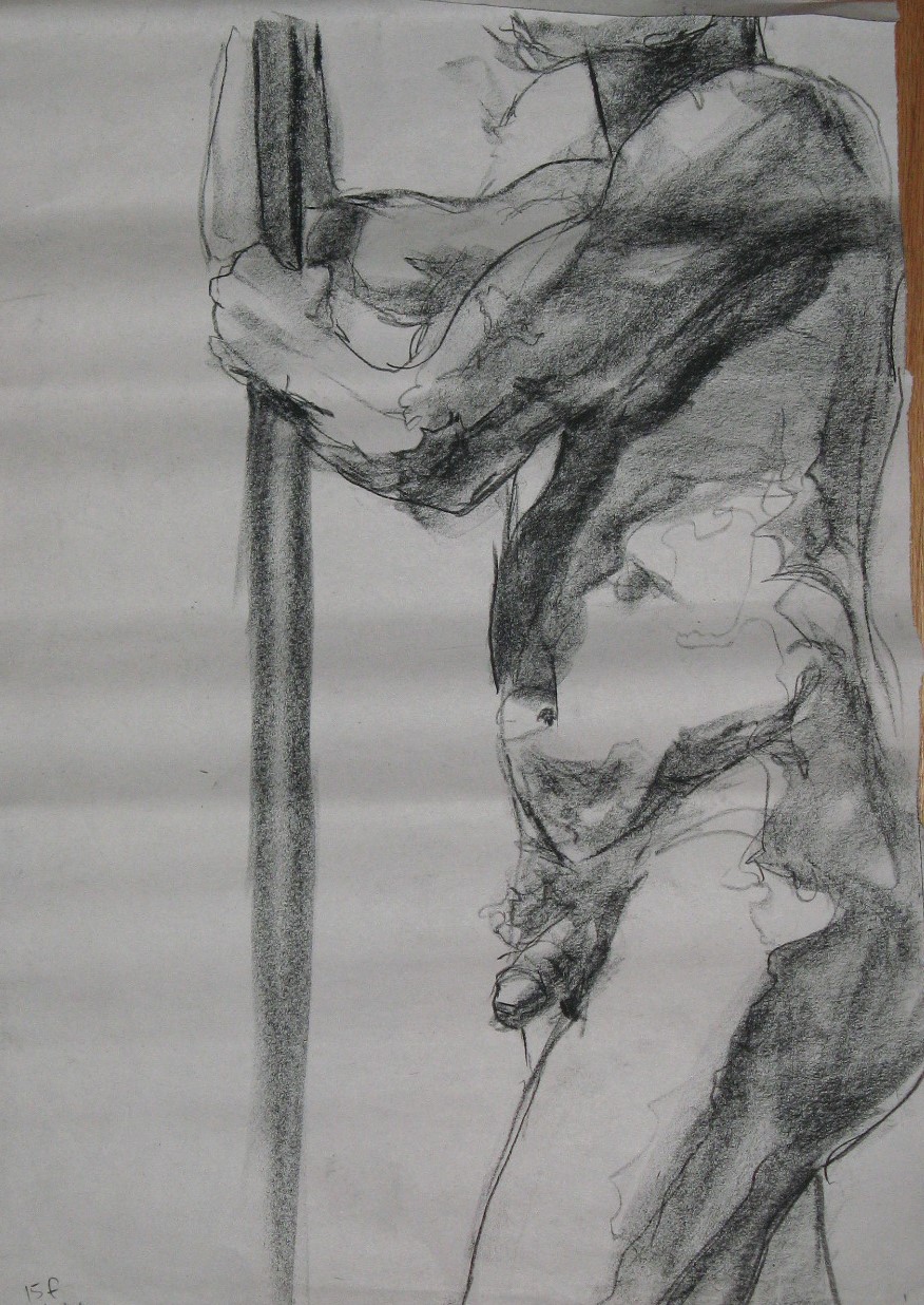
 On the next one, three out of four limbs (all but the left leg) are flat and undeveloped, and the neck–feh–but I knew right away that the hands and foot would need my attention. Even with 45 minutes for this pose, that’s not much for me when two hands and a foot are visible, and so clearly what the pose is about for me. They’re all a bit rough, but real to my eyes. I also like the torso.
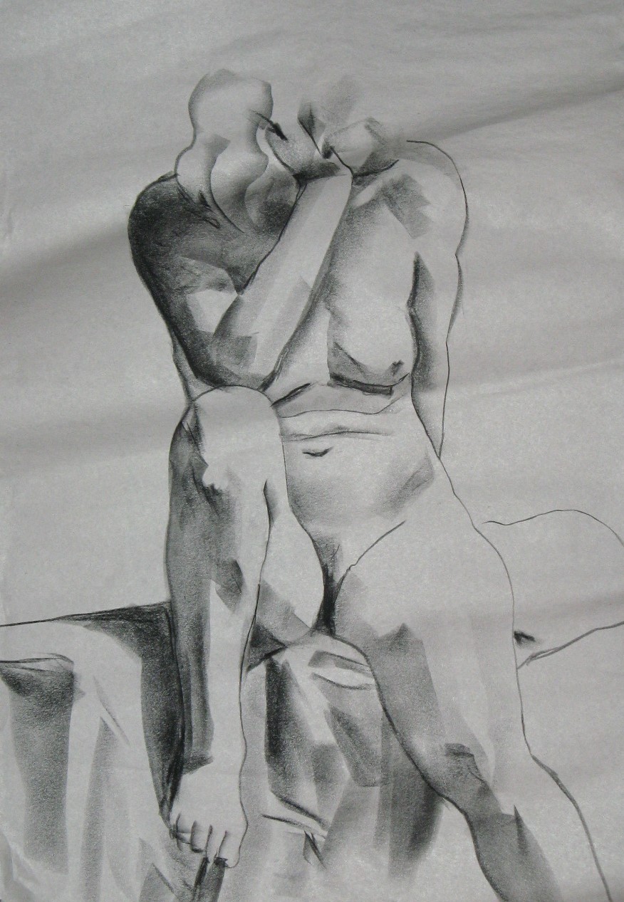
If you look at shadows you’ll often see a gradation, from darkest at the outside edge of the shadows, to lighter farther in, farther from the light it seems. You see it here, on both breasts and the left arm. I notice that phenomenon often but can’t reproduce it as well as I can see it.

More art journaling. I included this one . . . why did I include this one? I see almost nothing but flaws now. I’ll try to take off my perfectionism goggles and look again. Well, the left hand works. And the overlapping shadows along her right side. And I can feel the slump, the way her weight resting on her hands has made her stiffen her arms a little.
 This one went up on my wall. It’s dynamic and alive.
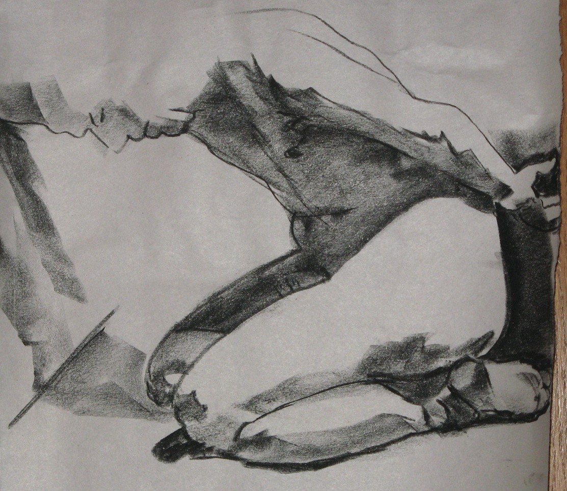
 The one below was done the same day as the one above. Hand, ankle, shadow, light.
 Same day, same model. Three different approaches. In this next one, I used much lighter marks, but still kept a strong sense of light–so, that can be done. The hand . . . well, sometimes you can draw a hand, and sometimes you can’t.
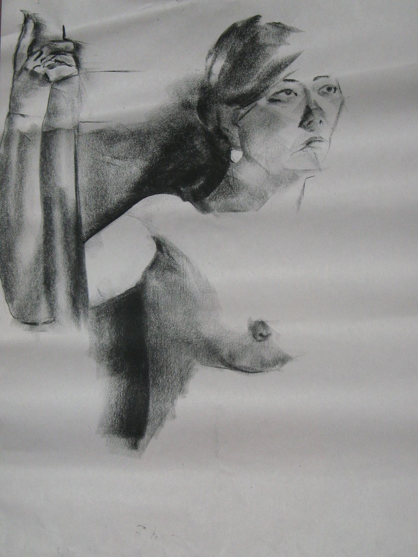
 And a fourth from the same day, also one for the wall to say “do more faces!” It’s quite a good likeness, and the hand gives a sense of pressing against the floor.
This was a departure. It was an accident, if I remember correctly; I was so compelled by her face that I put a lot of time into it, and didn’t get to much else except an outline (which I often like to indicate, not by a line at all, but by a contrast in shade between foreground and background. People don’t actually have lines around them). 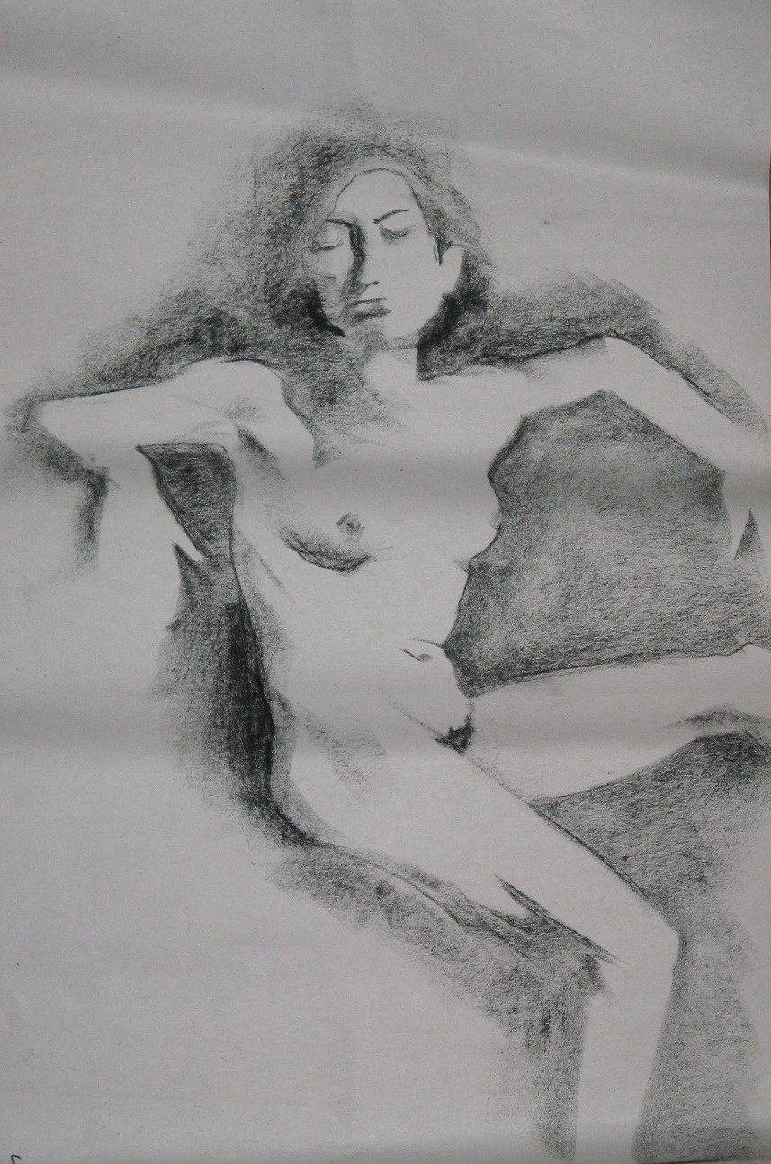
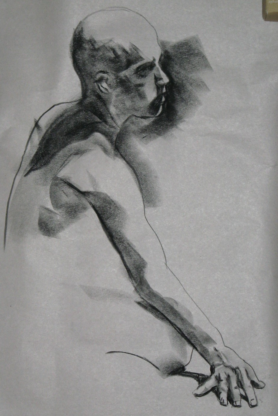
This one makes the cut mostly on account of his head and face. Speaking of foreground and background, this was a situation in which the hair and background were almost indistinguishable. I’m pleased that I conveyed that, though I didd’t have time to draw in the background on most of it–not that I felt the need to. There’s also some good stuff going on with the hands. When a pose makes visible both hands and both feet, I should pick two at most to focus on. There’s really not time for detail on all four. The result here was that the feet look half-finished. I could have just sketched the gesture of them instead, not even tried to put in any detail.

What am I always telling myself? More contrast! Advice I only occasionally follow. Sometimes I grit my teeth and limit myself to just a few shades: white, black, and almost-black. I did it in the next drawing and it was powerful.

I like how different the hands are on this next one, and how you can tell the tilt of her head from just a few lines. Also, I trusted the shadowy, indistinct nature of her right hand. I really couldn’t make out much except that dark silhouette. It’s hard not to extrapolate and mess up by drawing more than I can really see, but this time I resisted.
 The munchkin asked if she could keep this next one. It is her favorite on account of the bun. I didn’t know until then that she considers herself something of an expert in drawing hair, and with good reason–she went on to draw a spectacular hairdo. I got nothing on her for hair.
Still, I did okay with the hair here, but what made me keep this one was the light on the shoulderblades, arm and hands.

I’ve been following Ryan Bell’s Year Without God on and off, on Facebook and his blog. I’d heard him preach at a conference for clergy involved in PICO and been very impressed by this Seventh Day Adventist pastor and his passion for economic justice, so when I heard about his year-long experiment in “challeng[ing] his beliefs and let[ting] the world watch,” as his girlfriend Rebecca Pratt summarized it, there was no question but that I’d be among the watchers.
Now, the year has ended, Bell is firmly humanist and atheist, and the responses from many Christians, especially Adventists, are predictable: a sense of loss (“Very sad”), concern for his well-being (“I will pray for him”), anger (“He has made a calculated and sharp deal with his Master”), dismissal (“It is apparent that Brother Bell was living a lie for much of his life“), condescension (“Send him a Bible”), and running through them all, a powerful assumption that no one can be happy without the kind of belief that they themselves have (“Sad, dark and empty life”).
It’s tempting to see these responses as evidence that his former co-religionists are a particularly smug and self-righteous lot, and that if the tables were turned–if, say, a Unitarian Universalist became a Methodist–we liberal-religionists wouldn’t respond this way. However, I’m afraid many would.
Would we be able to let them go to their new spiritual home without criticizing it–“Christianity is just a myth–I prefer reality”? Would we insist on rewriting their life story–“You must not have understood science to begin with”? Would we proclaim our superiority with statements such as “Well, some people need a crutch”?
I cited the Christians whose responses to Bell’s journey have been defensive and judgmental. Fortunately, many others seem secure enough in their own faith to wish him only the best, accepting that spiritual paths other than their own might lead to a person’s being good, happy, and fulfilled. I hope every Unitarian Universalist who ever meets an ex-UU will do likewise. “Not all those who wander are lost,” we seekers like to say. And not all who choose a different path than ours are heading in the wrong direction.
Something happened to me several sessions back. I was drawing away, trying to pay attention to what was really before my eyes, how the light fell, how the shadows were shaped, what was the length of this limb, the bend of that joint, when suddenly, quietly, something turned right around inside. It felt as if I were on one of those big rigs that camerapeople sit on to shoot a movie scene from above, and it spun around 180 degrees and I was looking out from the model’s point of view. Instead of trying to draw what she looked like, I was trying to draw what it felt like to be her at that moment. And I thought, I’ve been doing this all backwards. I don’t want the viewers to see what I see; I want them to feel what the model feels.
Not that I know what that person feels, of course. But I know what it feels like to be a body, to twist my foot this way, to bend over so that my breath comes a bit short. I know what it’s like to be a human being who’s carrying a whole history inside. Maybe if my drawings help the viewer to feel some of the physical reality, not just see it but feel it, they’ll also enter empathetically into what it might be like to be that person. What is she thinking about? What worries, memories, speculations are in her mind? What emotions are occupying her right now? What events brought her to this moment in her life, and where does she imagine she’s going next?
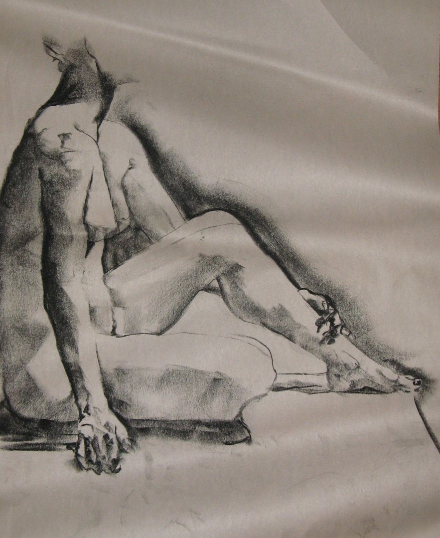
It was humbling. Here and there, though, looking back at drawings I did months before that chair spun me around, I can see that happening. This next one made the cut and was photographed on account of the stretch of the left arm and the slightly uncomfortable twist of the right foot. Looking at it, I begin to feel what it might be like inside this person’s skin.

The next one is the same day, the same model, and again I like the gestural quality best, the sense of what it’s like to be sitting there, turned that way. Now, her left arm looks tacked on like a Barbie’s, and I somehow situated her navel a couple inches above where it really is, so I can’t bear to put it in the very limited rotating gallery on my home-office wall. But I like a lot about it, particularly the tilt of her head and the feeling of her left hand pressing down on her thigh.

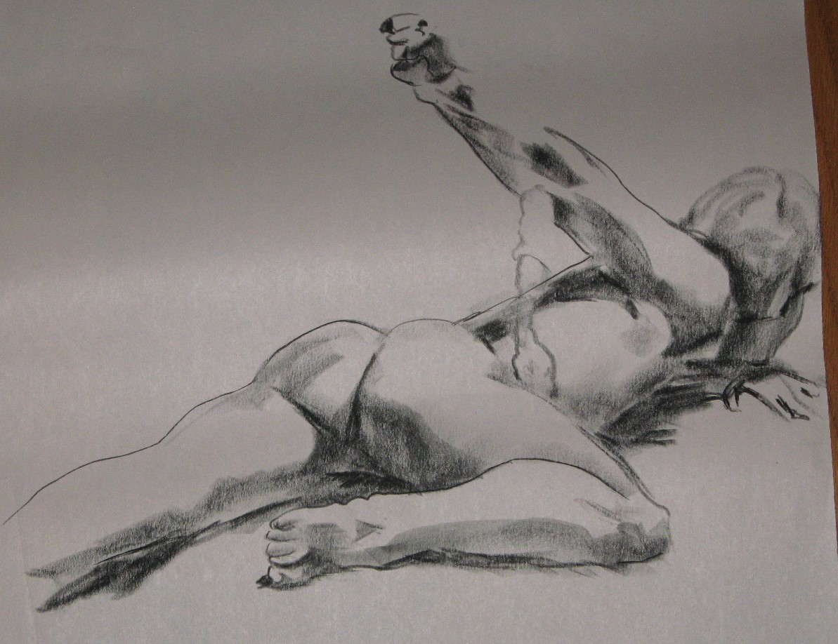
On this one (another day, another model) I just like the hand, especially the thumb. It’s very sketchy, but I got a lot across in seven minutes. Also, it represents the fading of my Fear of Buttocks. It’s just so hard to draw that part of the body without it looking like a cartoon: a caricature, the two scoops we all know are there but are actually very subtle. I’ve really worked on it.

Sometimes I feel the urge to use the tip of a charcoal pencil to draw contours of shadows and planes. It’s very spontaneous, the loosest I usually get. I’ve been fearful that it will be gimmicky, but it evokes a whole different kind of energy; I want to remember that and listen to when the situation is calling me to use it.
Same day, same model, different kind of marks. Here what works best is the hands, and again the gesture that makes me feel in my own neck the tension of that twist, and makes me feel in my own belly the way his belly folds on itself.

 As part of the 40 bags in 40 days de-cluttering challenge, I’ve tackled the backlog of drawings that have been piled, some flat, some rolled, some unceremoniously squashed, in various stashes around my car and home office. They ranged from late 2013 to this past Monday. I went through them rapidly, pulled out the best ones to photograph, put a few of those on the office wall, and put the pile you see here into the recycle bin.
There were 44 I deemed photo-worthy, which is too many to post at once, so I’ll post five or six per day over the next several days as part of this online art journal and try to cement in my mind what qualities made these some of the best of the past year’s work.
One thing I learn from this overview is that I am generally trying to do too much. The poses in these sessions last 45 minutes at most; the majority are seven to 10 minutes. That’s enough time for me to capture either the overall gesture with relatively little detail, or the details of just a couple of spots.
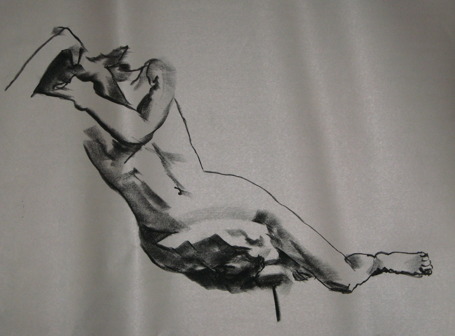
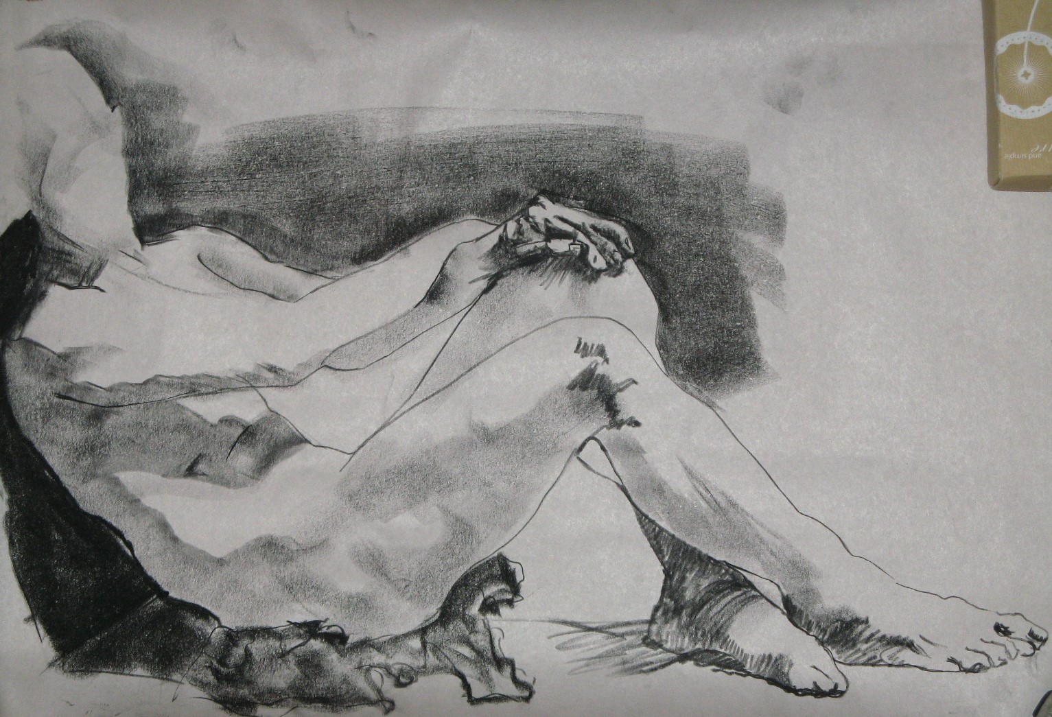
Here, I focused on the hands. Their attitude and the briefest of sketches of the body in between would have been enough to convey the feel of how she is sitting. The time I spent on her torso is mostly a diversion. The subtle shading of her lower back is a whole project unto itself, which I couldn’t do justice in 15 minutes, though I did better here than I often do.

I included the next one largely on the basis of the light across the chest and belly, and the overall gesture.
 I don’t often spend any time on the hair or face, and took the plunge with this next one. It’s here as a reminder to do that more often.
 What works in this one is the light in certain places: collarbone, knee, foot. I am often tempted to put slight shading in almost everywhere, which leads me down my oft-traveled road of low contrast. Leaving some of the paper really white is as important as going really dark.

This one commits a lot of the errors that make me want to ball the paper up–it’s stiff, I can see the hesitation in my marks, there are scale problems–but I like the hands, especially the right one, and the light on her right hip.
So much to learn, so much pleasure in the learning.


Recent comments