You are currently browsing the category archive for the ‘art’ category.
Mostly hands and feet . . .


.
.
. . . though my favorite of the day is this full-length one (well, almost full-length; the model does have a head!):

(Click on images to enlarge)
As usual, a mixed bag. Each of these has something about it that was successful. I’m encouraged by this, because I’m feeling stuck–like I keep doing the same things that aren’t working. So it’s good to remember that some things are working even so.
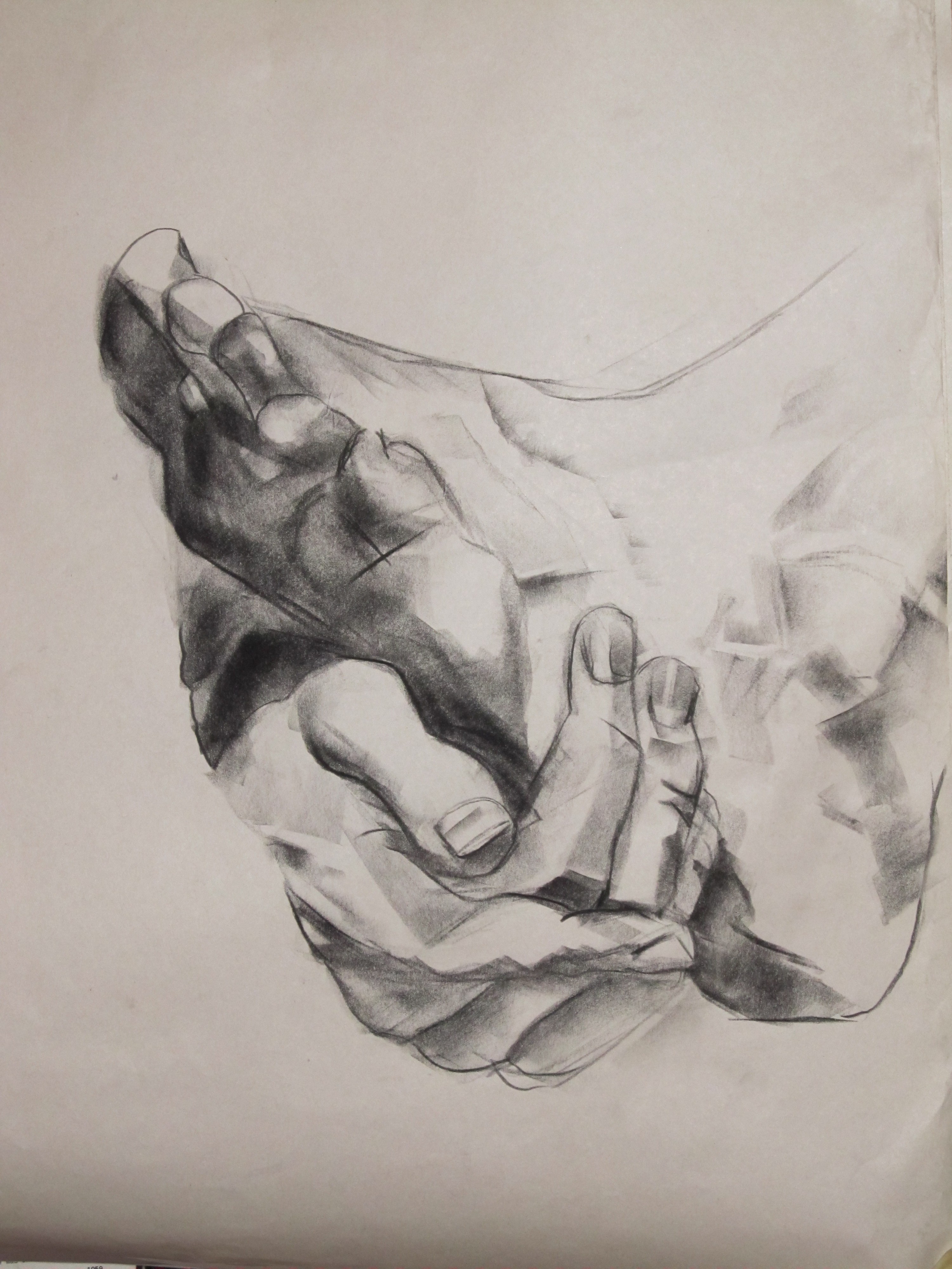
Some hands that are coming along:


I loved working on this hand, with its big ring and relaxed position. The finger the ring is on didn’t work right. The two on either side bend but it just looks, I don’t know, mangled. Fingers are almost like eyes: a few lines and shadows are enough to show their true shape; get one wrong by a little bit, and suddenly they are barely recognizable. And hands are almost as expressive as faces. I’ve been trying to sit up close so that even my increasingly myopic eyes can focus on the model’s hands without squinting, because they are still mostly what I want to draw. Although this one, Woman with Mangled Middle Finger, captures the overall expression of the pose too:

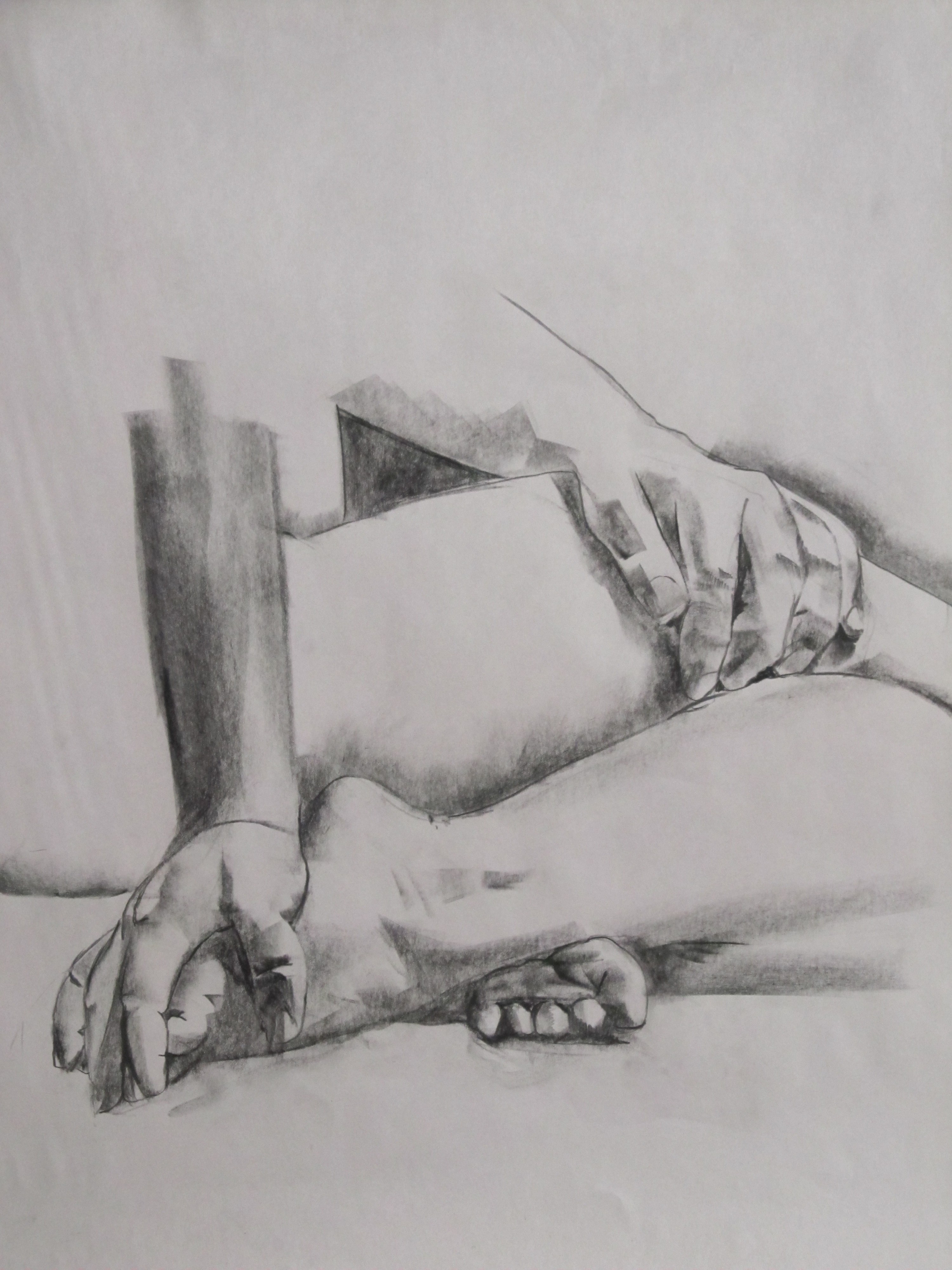
On this one, I knew as I drew the left arm that I was making it too short in order to fit everything on the page. I just couldn’t face starting on a new page at a smaller scale, or abandoning the attempt to get both hands in. Ah well, the focus of the drawing was really the two hands anyway, though I like the whole attitude of her upper body:

Nothing works here but the elbow, which I do like:

My aim in this one was to include both hands. The left one got short shrift and so came out flat. The right one, though, is a lesson to me in how few marks are needed to make the full shapes emerge. It’s quite minimal and yet it works, unlike the more elaborate shading on the forearm.

In desperation on a bad day, I really changed the kinds of marks I was making. That often helps, and in this case, it had interesting results (if a somewhat more dramatic appearance than I really like), and loosened me up so that another good one was possible (the first drawing in this post, above). Maybe I should bring along pastels or pencils so that if nothing is going well, I can ditch the charcoal and try something really different.

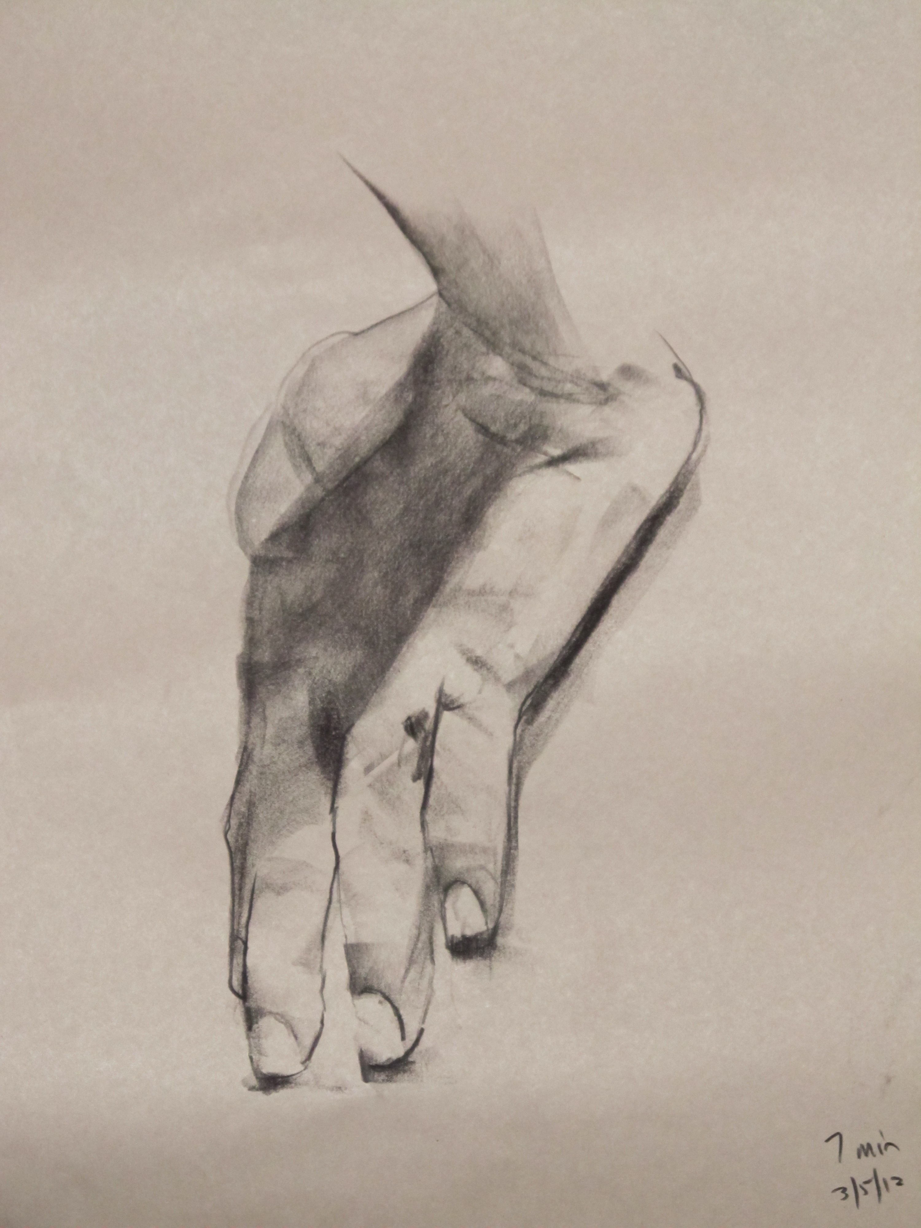
On this one I made myself work fast. It was only a seven-minute pose but I really wanted her whole torso and that nice twist of her neck, so fast was the only option. I tend to fuss too much over details, so speed is a good antidote.
 On this one some of the shadows on the back are way too dark and defined, but there is a light on the right shoulder that I was going for and got:

One thing I figured out after yesterday’s session, and after reflecting on what’s been hardest for me these past three sessions, is that I am working too big. Many of these sketches fill an 18×24 paper. I went in that direction in order to get into more detail in places, but it’s gone too far and seems to be making it harder to capture subtleties of light, not easier. Next week I’m going to scale it all back down, and that might be the change that bumps me out of this rut. I should probably cut the paper in half to help myself along.
I still have to make my final, week-late Black History Month post. Today, though, just drawings. Mostly hands; a few feet. Our church’s lobby serves as a rotating monthly gallery, and I’m seriously contemplating having a show there consisting entirely of drawings of hands, but I’d have to have 8-10 drawings I was happy with. None of these is quite it, though the top left one comes closest. The model with the fabulous hands was there again this morning. I’m going to do justice to those veins eventually.


Black History Month, day 20
It’s my drawing day, so I went looking for figurative drawings by African-American artists and found some beauties.
“Study for Willie J.,” by Charles White
Self Portrait, by Samella Lewis. She was 19 years old.
“Morning Is Here, No Dawn,” by John Thomas Biggers (photo #4 in the slideshow). Actually, this one is a lithograph, but wow, what a draftsman.
Also, just today we went to SFMOMA and I was intrigued by the very different kind of work of Mark Bradford: very large collages, or assemblages–or given his process, maybe the term is disassemblages–made of many layers of found paper. By the time we got to that floor, the munchkin was very anxious to get to the children’s room, so I only got a peek. I will have to go back and spend a long time looking at these without a child in tow.
Black History Month, day 12

Romare Bearden, image by Roy DeCarava, (c) Sherry Turner DeCarava 2012, courtesy The DeCarava Archives.
Yesterday I alluded to the music and art of the Harlem Renaissance as well as the poetry. I first encountered the art of Harlem Renaissance artist Romare Bearden when I took a collage class in high school, and when I set up this blog, his was one of the names on my blogroll of artists. He had an amazing gift for texture and color, as well as the juxtaposition that is built in to collage (his most frequent medium), and used them to tell stories, evoke the sound of music, portray a place or people . . . His pieces are complex, accessible, rich in allusions, and both emotional and philosophical.
In Early Morning, for example: the woman’s arms both fit with the rest of her and set up a contrast that speaks of other places, maybe the places where her thoughts are now. The arms are languid, flat like a Matisse collage; they contrast with her tired face, which is portrayed more realistically and itself has a contrast between the Madonna gaze of the eyes and the determined set of the jaw. Her head scarf, apron, and dress speak of the kitchen, while her arms suggest a more romantic setting where she might be dancing, sleeping, or making love. And still, that right arm is not only part of her, but part of the background–of the wall, in fact. As if she is there and not there, as one might be at a moment when duty calls one way and longing another and especially here in early morning, when one’s mind is still half in the night’s dreams. All of that from one figure, and a background figure at that. This is why I feel the way August Wilson does about the effect of Romare Bearden’s pieces: “I was looking at myself in ways I hadn’t thought of before and have never ceased to think of since.”
Only in writing this post did I learn that Bearden’s centennial is being celebrated right now, between September 2011 and September 2012. If you’re near Cincinnati, Tampa, or New York, check out one of the exhibits in honor of this anniversary; looks like others are in the works. Folks in my part of the world, you can see his mural “Berkeley: The City and its People” anytime by popping into the chambers of the Berkeley City Council.
The above is my favorite picture of Bearden. I love the way the photographer, Roy DeCarava (another terrific African-American artist), made the photo look like a collage too.
. . . when the only reason to keep photos of the drawings seems to be so that when I look back on several months of work, I’ll remember that there are bad days. At least, that’s what I thought looking over my drawings last night. But because I was having a hard time, I tried to change things up. I drew this really dark, for example. I tend to go too light, exacerbated when the model has really light skin, and on a bad day I go lighter because I’m feeling tentative. I don’t want to commit to anything I put on paper. For the same reason, I draw more slowly when I’m thinking everything I’m doing stinks. So I forced myself to use only the darkest charcoal and work fast and with minimum pauses on this one, and it helped loosen me up.

I even ventured into territory I’ve mostly stayed out of and started drawing her face. The head is too small in proportion to the body, but each on its own is not bad. I stared at that right thigh, trying to find a change in tone in it, and whatever was there was too subtle for me. Leaving it blank makes it look flat.
The drawing I was happiest with was this one. I sweated over that first-finger knuckle. Just about gave up on its looking like anything except a glaring white circle on a dark expanse, but when I walked away and came back to look at the drawing, there it was, looking almost real. So was the vein in the arm, which I’d given up as a failure. Drawing is like magic.

An interesting problem raised by this last one: how to show the different textures of skin and cloth. I just left the cloth more or less blank–it wasn’t what interested me this time–but I’ll have to go back to it sometime. I remember having an exercise like that back in Drawing 101, a class in which I struggled mightily–no, that makes it sound like I worked really hard and wrestled with my demons, when actually what I did was mostly avoid drawing and hide from my demons. We were supposed to draw different textures, so I drew a skirt hanger with four skirts on it; one was corduroy, I recall, and one thin cotton. Maybe that would be just the thing to try again.

 I wasn’t going to show the lousy ones, but that’s not fair. Here are a couple I wanted to scrunch into a ball and throw away. Stiff, tentative . . . yep, there are days like that. I had fun just the same. Also, one of the CDs played was The Ghost of Tom Joad, a Springsteen album I don’t remember hearing before. A good day after all.
Nothing to do with Black History Month–just three more drawings from last Monday and my ongoing adventure of trying to draw hands.


I love this model and wish he worked in the studio more often, especially now that I’m drawing lots of hands and feet. His are wonderfully veiny. Still, something that figure drawing has taught me is that there is no such thing as an uninteresting or un-beautiful human body, so I’ll enjoy all the other models too, until he comes around again.
I’d left the house in a hurry, chivvying the child, and forgotten my drawing stuff, so I only had the studio’s charcoal: no pencils, and I could only find very dark and very light charcoal. This has happened before and makes for an interesting challenge: to use the edge and corners of the charcoal for fine lines, and develop a light touch with very soft, dark charcoal. The latter in particular is tough for me, and I got better at it today.
(Click on images to enlarge)


My favorites from last week’s session


and today’s.


What’s going on in my head in the studio has changed so much in the past few months. The idea that the main effort in making a drawing might be to portray the light is one I’ve heard many times before, as has anyone who grew up in an era that adores the Impressionists. But that I would make that my aim, myself, is completely new. It’s as if I have never seen the way the light falls (I won’t say “seen the light”!)–at least not in quite this way, with this attention.
Recently I was playing the piano, which I do very badly, and Joy, who does it very well and is a good teacher, said, “The whole phrase is about that G. That’s what you want to be aiming for. Not by making it louder . . . ”
How, then, I asked?
“Mostly you just think about it.”
So I played it again, thinking about it. I couldn’t hear the difference, yet, but she could, and said, “Exactly!”
That’s what drawing with an eye on the light is like. Of course I’ve always seen the light on a person’s arm as I drew the arm. But now I am aiming to draw the light. It makes a big difference.
My figure drawing time resumed on Monday after a month away. It felt great to be drawing again. I spread them out on the kitchen floor after dinner and the munchkin and I looked them over. She said this was the best one “because it looks like a person.” It didn’t look much like the person I was drawing, so it was nice to see it through the eyes of someone who couldn’t compare the two.

She also liked this one, which is the one I like best,

and this.

She wanted to know why I draw all in black, white, and gray, instead of in color the way she does. I told her the truth, which is that it’s hard enough for me to manage black and white and I’m not up for the challenge of color right now. She also asked why I draw people naked instead of in their clothes. I said because that way I can see a lot of the beautiful parts that clothes cover up. She looked unconvinced. I think for her, clothes are more interesting and probably more beautiful.


When I told Munchkin I had been working on the veins of hands and feet, she jumped up to point them all out on the drawings. I explained what I found difficult and interesting about them, leading to a question from M: “What does subtle mean?”
The other subtle thing I decided to tackle today is the highlight that runs right along some places, like the muscles of calf and thigh here. I have never paid it enough attention and it comes out looking streaky, obvious (not subtle!), or nonexistent. Monday I really tried to look at it and see what its edge looks like. It was so absorbing that in twenty minutes, I never really got to any other part of the drawing, not even the knee, which looks kind of flat as a result.


Recent comments