You are currently browsing the category archive for the ‘art’ category.
My morning of drawing this week. I was enjoying the newsprint so much that I never moved on to charcoal paper. I like the smoothness and may try out some smooth white paper, like Bristol.
A few of the two-minute gestures:

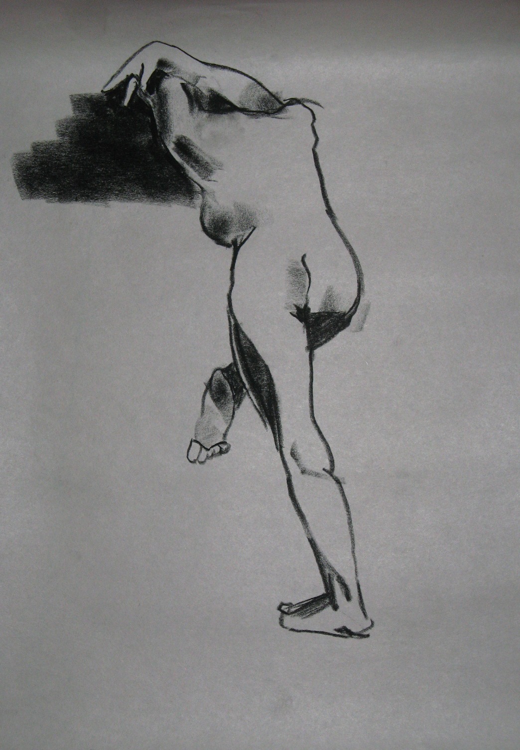
Three seven-minute:


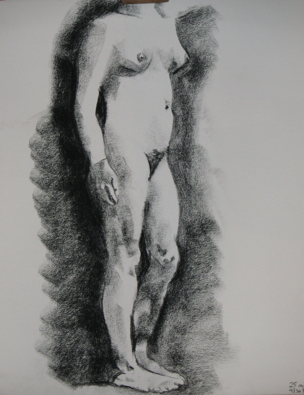
Two ten-minute–the second looks like watercolor to me, a nice effect I now want to try to recreate deliberately:


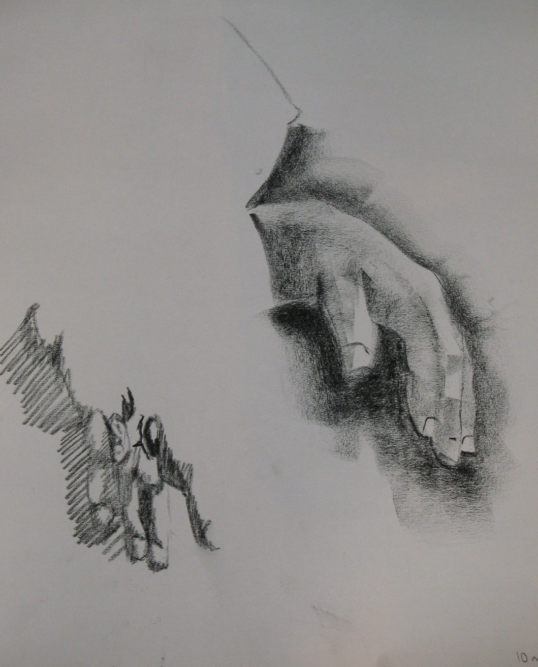
Twenty:

And 45, still not enough time this time:
When I arrived at drawing this morning, I felt stressed out and grumpy. Drawing straightened me out. It offers two of the best remedies for the blues: work and beauty.
For the warmup one- and two-minute gestures, the model mostly chose poses with a lot of twist, heart-meltingly lovely:


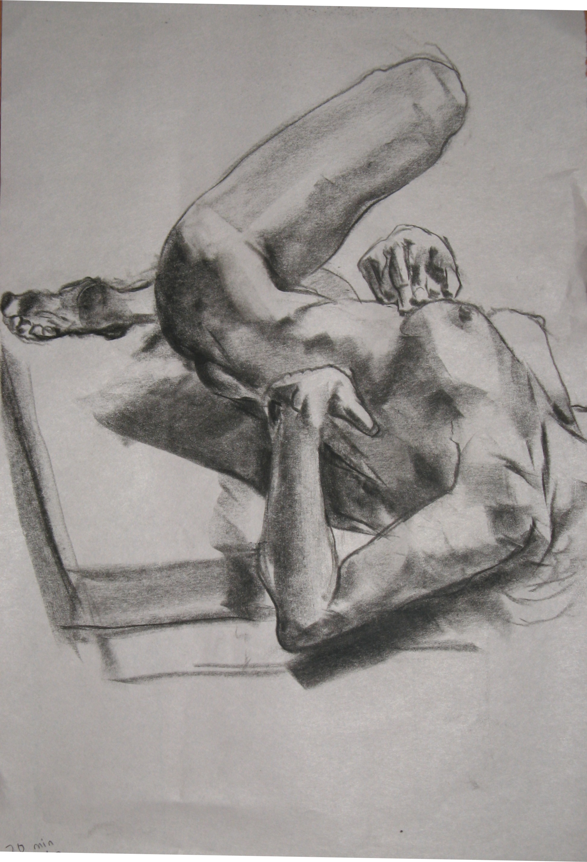
Something good was happening in my drawings of the ten-minute poses, and the last one here (20 min) has some of the best drawing I’ve done in a long time, if not ever. In them, and especially in the last two, I used a slightly different approach to get the edges of the shadows. It’s so obvious that I don’t know why (a) I didn’t do it before, and (b) it makes such a difference, but I didn’t and it does.


A card stuck to a bookcase in my childhood home had this quote (more or less) from T. H. White’s The Once and Future King typed on it.
“The best thing for being sad,” replied Merlyn . . . “is to learn something. That is the only thing that never fails. . .. Learn why the world wags and what wags it. That is the only thing the mind can never exhaust, never alienate, never be tortured by, never fear or distrust, and never dream of regretting. Learning is the thing for you.”
When I was a teenager, I discovered that if I substituted “creative work” for “learning,” this rang even more true for me. Maybe they’re the same thing. Throw in some contemplation of beauty, too, and a bad mood doesn’t stand a chance.
As an artist who’s been focusing almost entirely on figurative (that is, realistic, not abstract) drawings for the past several years, I sometimes wonder what the point is. Drawing helps me to see the world more clearly, but does it help the viewer to do the same? Doesn’t the most successful realism defeat its own purpose, in that people look at it and say, “Right, that’s a person,” without seeing any differently than they did before? I want to help people to have the experience I have when I draw: to get beyond “Well done, it really looks like her” to “That’s something I never noticed about her before.” I’m not sure realism can get them there.
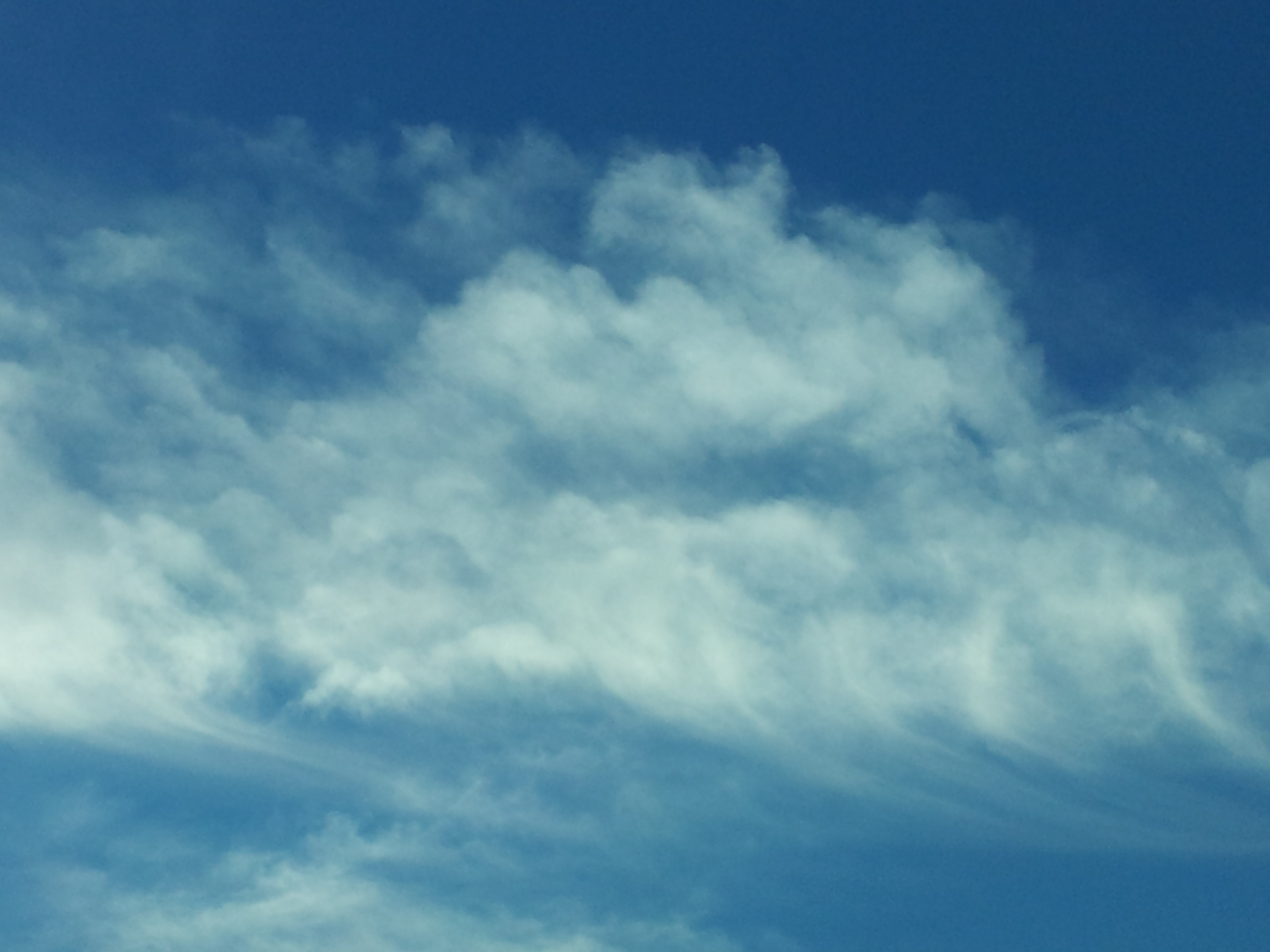
Photo by Amy Zucker Morgenstern
At least, I wasn’t until recently, when I realized that I am really looking at clouds for the first time in my life. I don’t know how I got to this age without noticing that the clouds are different every day, and every few moments. That they come in an incredible variety of shapes that the nomenclature of cirrus, cumulus, cumulonimbus, stratus doesn’t capture. That their colors are infinitely varied even in simple mid-day light. I do have a pretty good idea what made me finally notice them. It was the paintings of two artists, Diego Rivera and Wendy Miller.

Photo by Amy Zucker Morgenstern
Wendy is an artist I know who lives in my neighborhood, and I saw her paintings for the first time when I moved here in 2010. Diego Rivera’s cloud paintings were unknown to me until earlier that same year, when we went to the Museo Dolores Olmedo in Mexico City and saw a whole series that he did from the balcony of his patron’s home (Dolores Olmedo herself, if I recall correctly), one evening after another, at sunset. I looked admiringly at both artists’ gorgeous paintings of clouds, acknowledging how difficult it must have been to portray them so vividly, but something beyond that happened inside me. Inside my eyes, I think, or whatever parts of me are needed to perceive clouds, because I see them now.
I do a lot of driving up and down the San Francisco Peninsula. There’s nothing new about that; I did it before 2010 too. Now, though, the clouds up ahead hold wonders for me every day, and now I know firsthand that “merely” painting what we see can open others’ eyes.
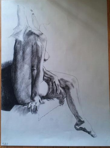
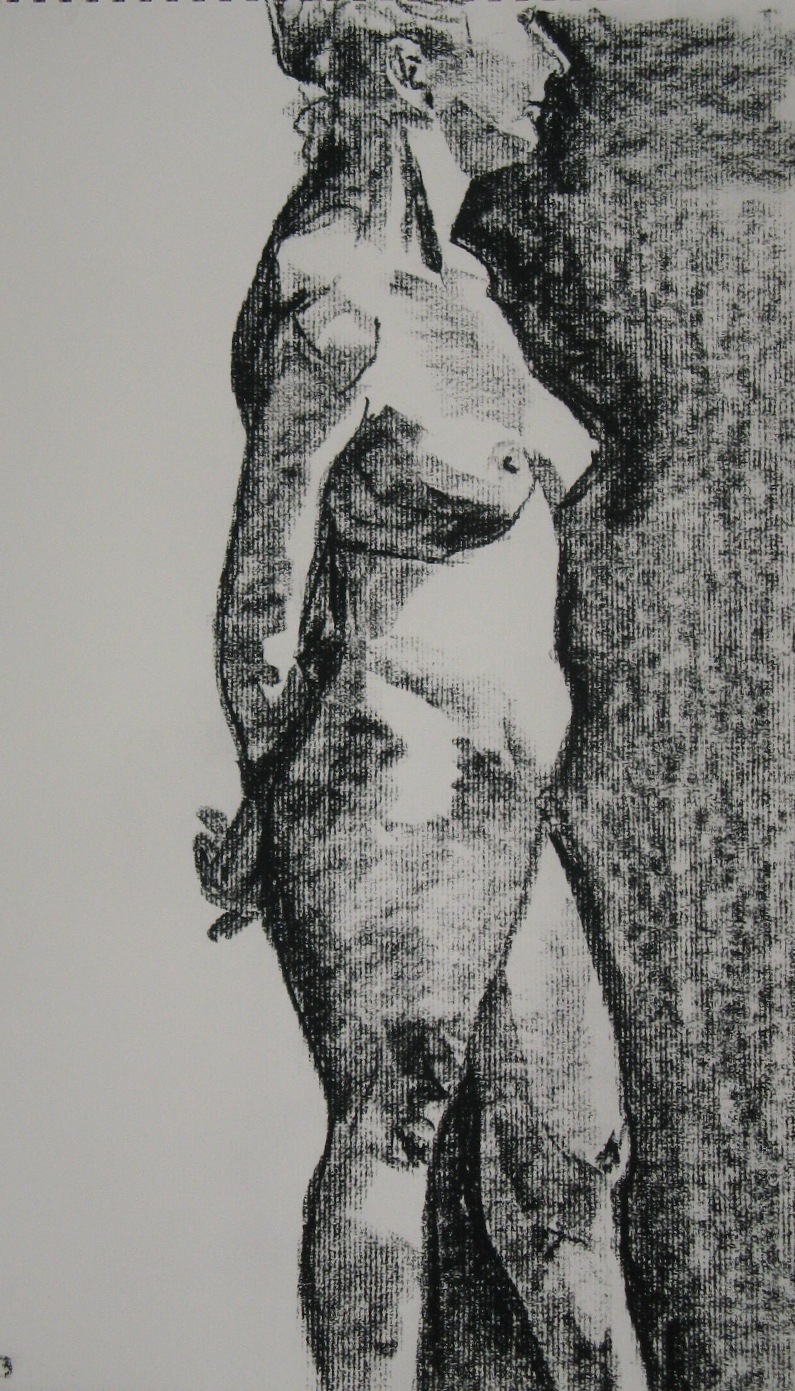
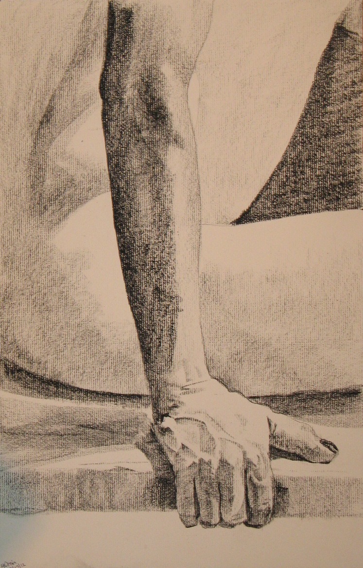
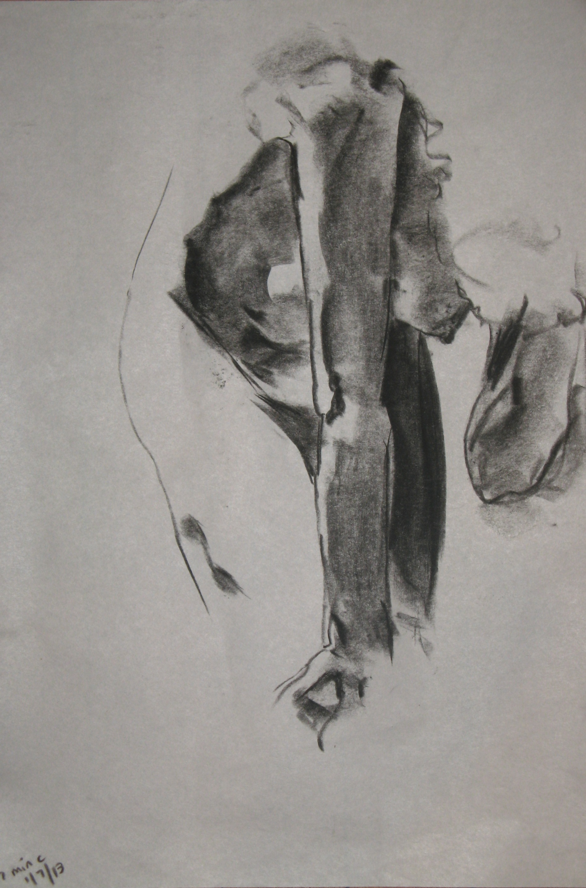
As part of my study leave last week, I did an extra session at the figure drawing studio, so today’s session was the third in eight days. The cumulative effect was very positive–unless it is a coincidence that last Wednesday was better than last Monday and today was better than last Wednesday. I don’t think so. I think I powered through to a better place, because today was full of “aha”s. I was working small and with a fair amount of detail, but I mostly kept the gestural quality that I like instead of going all stiff, and I know how I did it. The first “aha” was with this one. Sometime during this seven minutes, I realized that the life was in the parts that had no lines, but were just drawn in with shadows:
So I set out to draw almost nothing but the shadows, and this was the result:

AHA! Definitely getting somewhere! I did the same for this gorgeous pose:
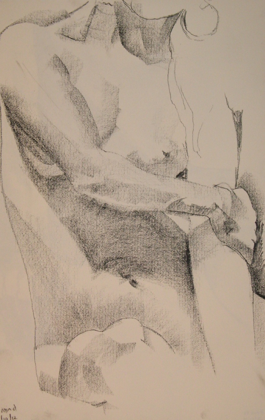
The above is my favorite of the day. I wanted to stay with that pose for the rest of the session, but alas, it was only ten minutes.
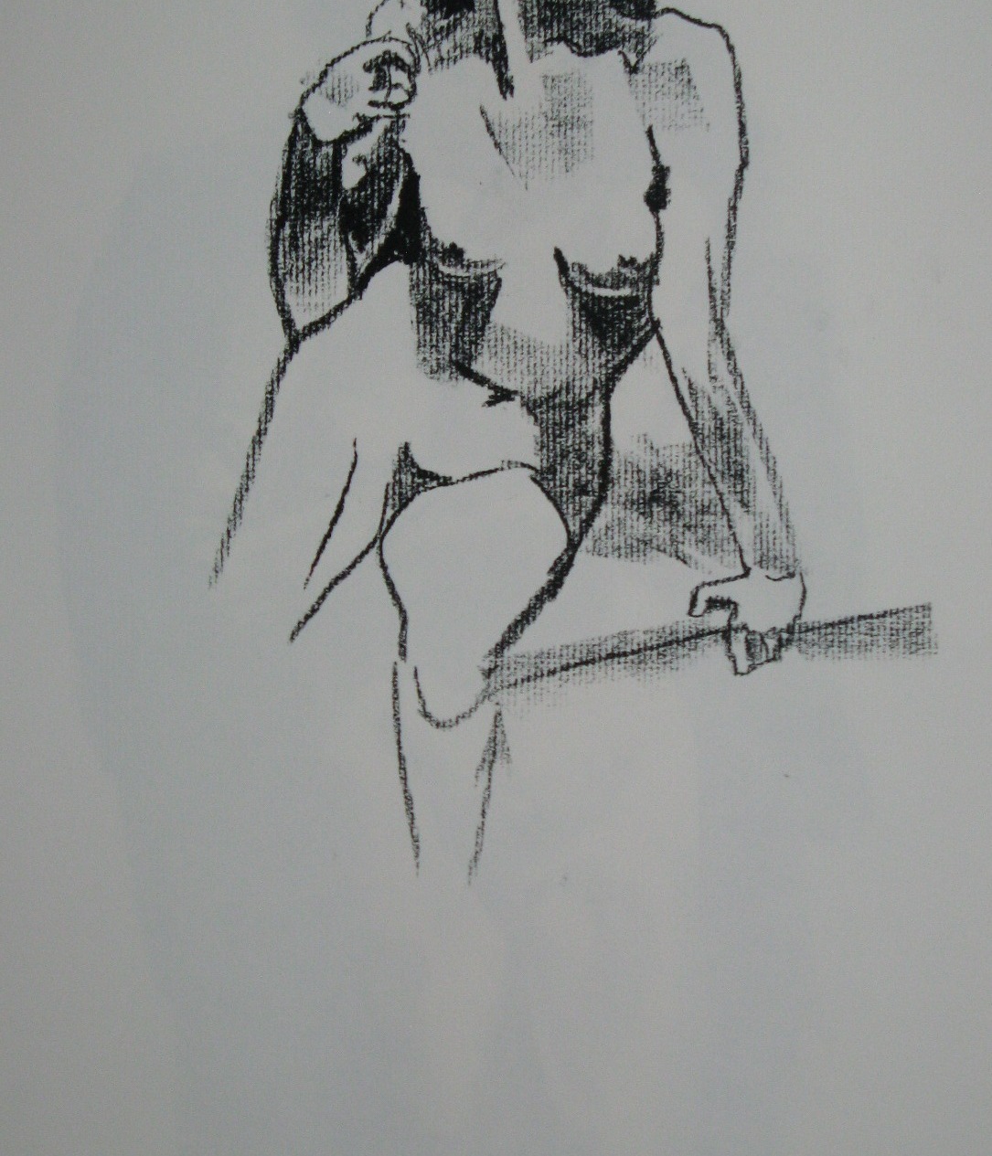
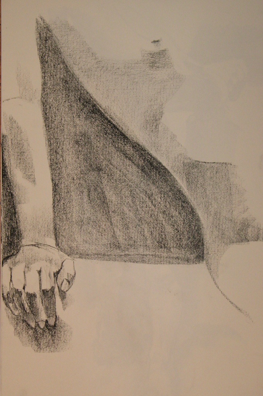
We had a forty-minute pose, and I am happy with both the face and the body in the drawing that resulted, but d’oh! they are out of proportion to each other. It’s really hard not to go too large on a section that I do last and give lots of attention:

I needed a few more minutes on the legs, too. But I used the time to tackle the hair, something I usually ignore, and it’s not bad.
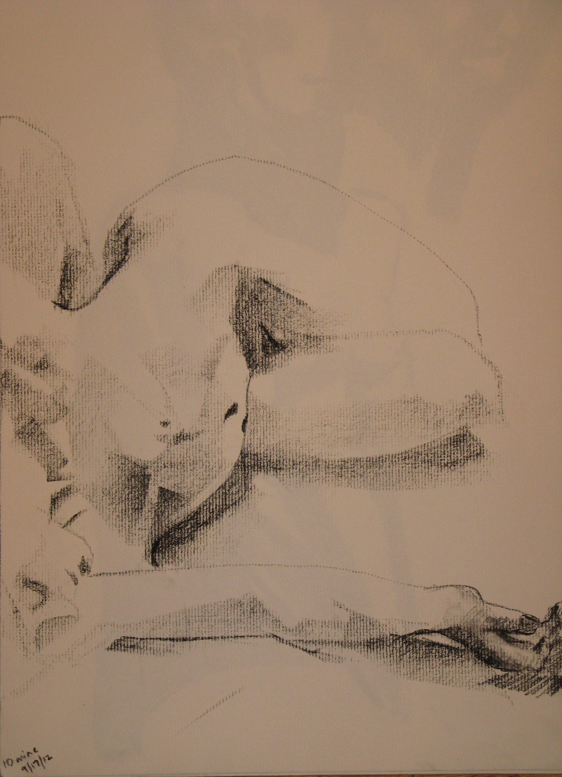
Here are the first two of the day. Not bad, but pre-breakthrough. The fabric on the first one works pretty well even though (because?) I gave it only the most cursory attention.

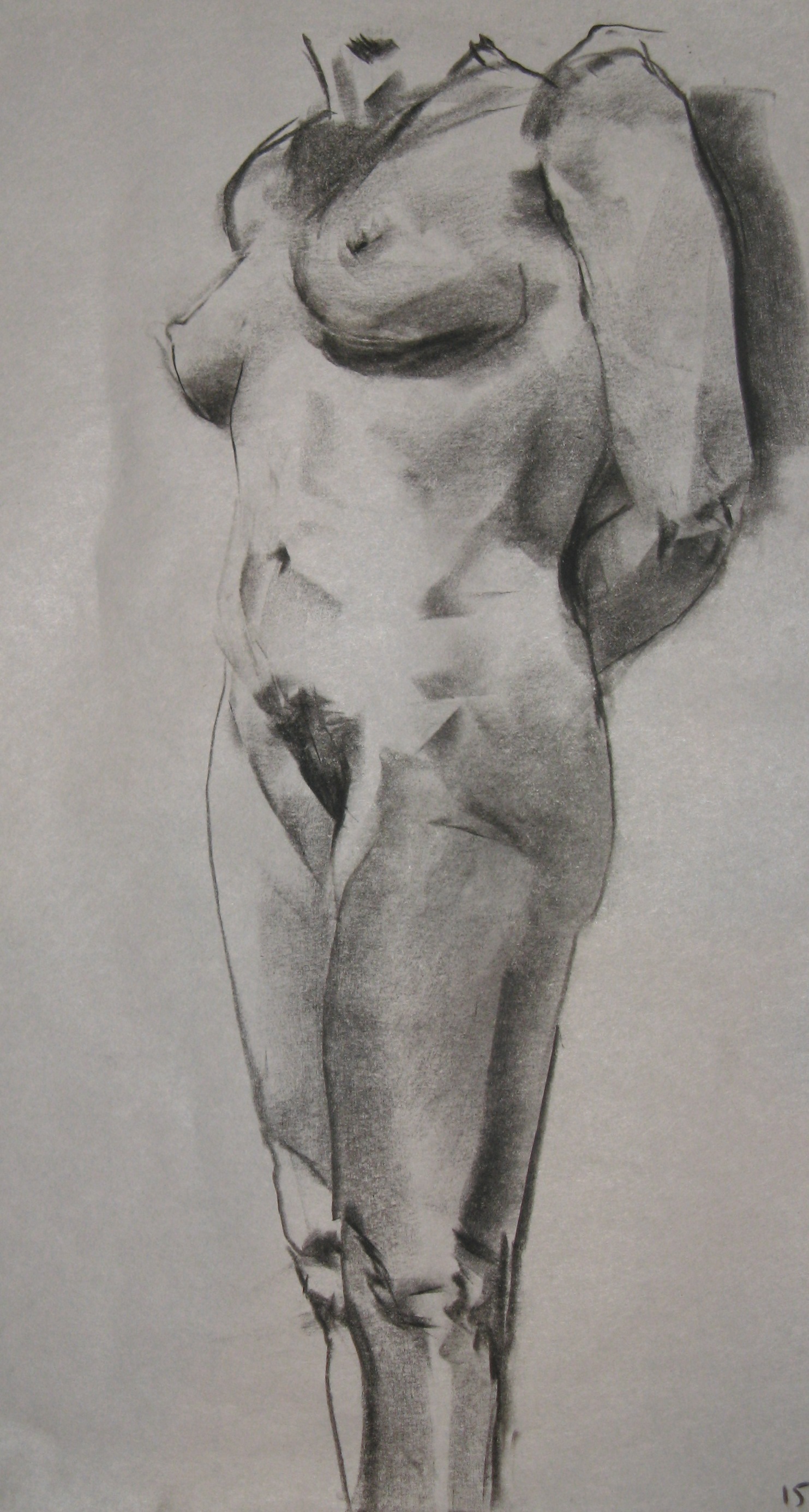
I never note scale on these drawings, and I ought to for my own purposes down the line (I toss most of the drawings, so I only have digital versions and will never remember the original dimensions). These are on 11 x 14 paper; I went to that smaller format deliberately because the larger paper was “making it harder to capture subtleties of light, not easier.” If I can remember what I’ve done today, it may work well to go back to a larger sheet. I’m not even sure what was going on there–just that I am now at the point that I have to use little tiny pieces of charcoal in order to work in the space I’ve allotted myself, and that’s getting old. This was also the first day that I didn’t use newsprint at all, and I didn’t freeze up, so I’m going to keep on doing everything but the warmup gestures on the good paper and see where that leads.
Some I like, at least bits of them (nice light / hand / knee!), some I don’t (so stiff!), one I threw out without wanting even to look at it anymore, much less photograph it. But I haven’t posted any drawings in ages, and I am going to dispense with commentary and just get them up here.


I’m just about to start a photo-a-day challenge. Among other things, the organizer, Michelle Favreault, predicts it will “allow you to expand ways of integrating visual arts into your ministry.” Even before I signed up for it, it had recently occurred to me that I could build an entire worship service around Annie Leibovitz’s photograph Susan Sontag, Petra, Jordan.
This photo is one of dozens on the postcard rack that lives in our house. We have many more postcards than display slots, so most are hidden behind others, emerging at different times. When we got back to our house after a month’s absence, this one was visible and turned toward the sofa, from which I have been contemplating it. I recommend backing away enough that your experience of it is something like mine when I look at a 4″x4″ square image from a distance of a few feet.
I won’t write the whole sermon today; I’m a bit preoccupied with the one I’m giving on Sunday. But my thoughts, to give them in the vague and chaotic form they take before they’re pulpit-ready, include:
- it’s a vivid example of negative space, compelling the eye to travel between the foreground and the background. Which one is the subject? Or is neither one the subject?
- at least three elements balance here: the very small human figure, the very tall buildings of Petra (built by people), the massive rocks (built by no one) that dominate the foreground.
- it suggests a relationship among the natural world, human-made artifacts, and humans.
- furthermore, one of the most memorable points about human beings and Petra is: there aren’t any there. The people who created it are long gone, and we’re not sure who they were. The only living person in the photo is a mere silhouette.
- the overall shape of the glimpse of Petra is evocative of a standing person.
- the three elements occupy different time scales. In the scale of Petra, Sontag’s life is a blink of an eye (she will in fact be dead ten years after this photo is taken); in the scale of the living rock into which Petra is cut, the buildings and the civilization that carved them are no more than that; and what is the lifespan of the rock, in galactic terms? Nothing more than a blink either. I’m thinking “Ozymandias” would be an appropriate verbal text to go with the visual “text” in this service.
- the building seen in the photo is called the Treasury, evoking questions of where and what treasure is. The fact that it was probably not a treasury at all, but a mausoleum, only deepens the questions of what we claim has value, what really has value, and what any of it means in the face of impermanence. Knowing that no one and nothing lasts forever, how would we answer the question: what is most precious?
That’s enough. If I actually develop the sermon, I’ll give a heads-up here.
Ooh was I having fun today. Here are the drawings I like best.
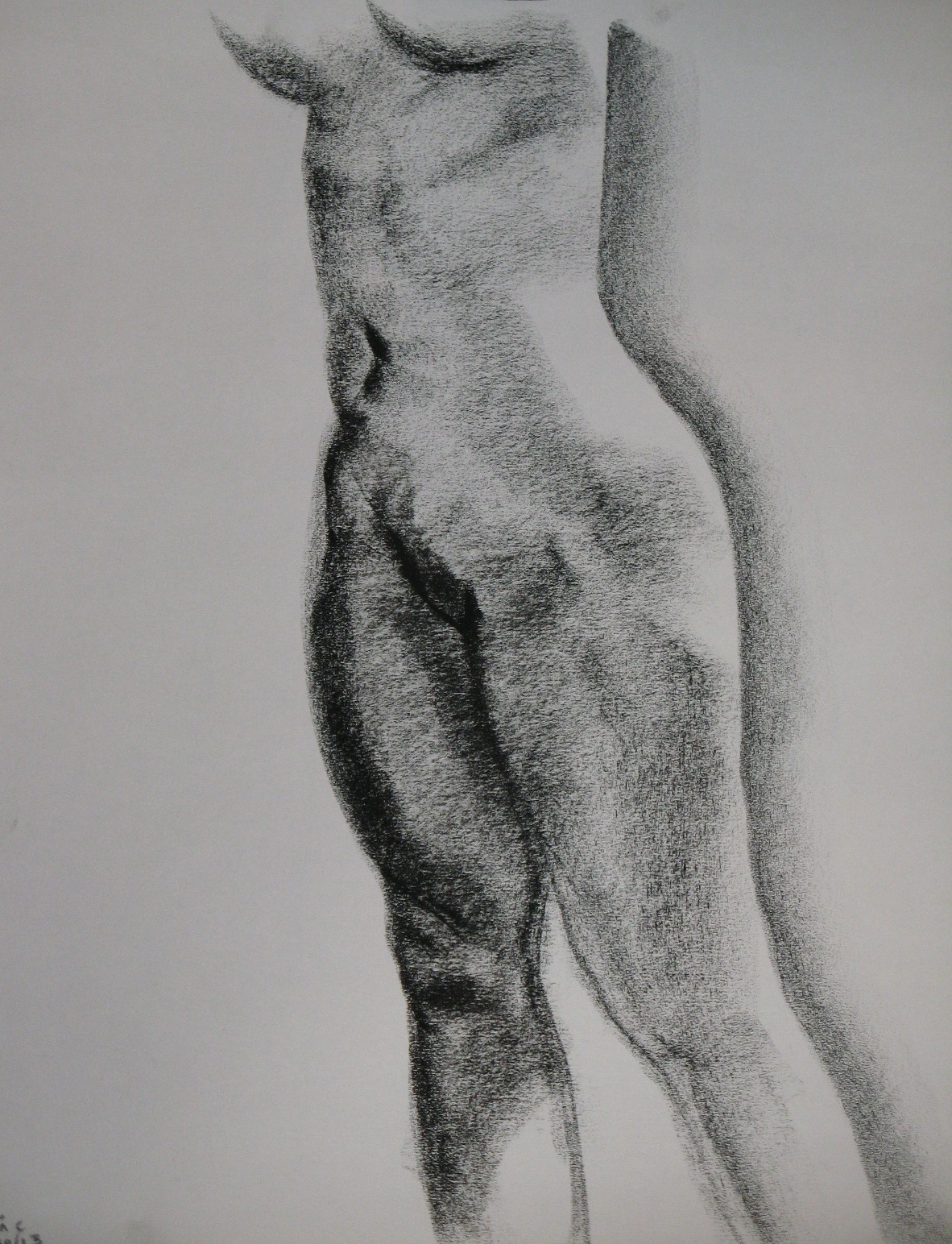
Something I’ve been trying to do is cut down on the range of tones. I can get lost in the jungle of an infinite variety of shades, fussing so much to get each one right that I lose the big picture and the passion. So I’ve been trying to go darker and leave white in places that do have subtle gradations of light and shadow.
On the other hand, when I use a broader range of grays, I can convey more about the light. With the longer poses I have time to do that. The light was so interesting in this one, but the drawing came out kind of messy and indefinite.

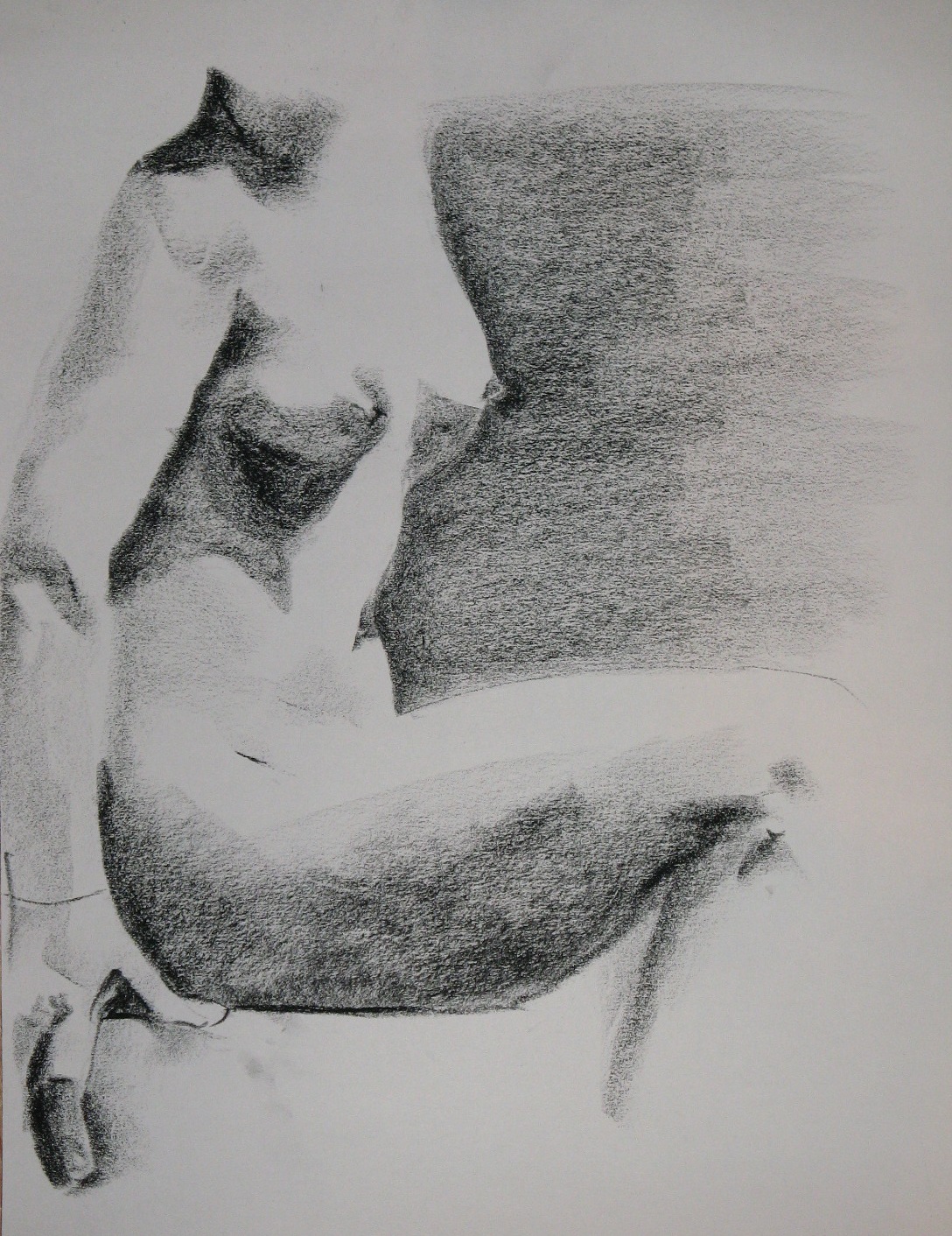
I like the light in this one best, which is probably why it’s my favorite for the day.

Faces are so tricky. This one was looking quite a bit like the model until I made just a couple more strokes. Now it doesn’t look like her at all:
I took a deep breath, took a big step and tossed a dozen or more Mondays’ worth of drawings into the recycling. I like taking photos of them for the record, but I don’t always keep up, and the backlog had become a pile. At some point even a somewhat obsessive-compulsive person has to ask whether the time invested in such a project is worthwhile. I felt a pang as I tossed them into the big blue bin, knowing that there were some lovely bits in there along with a lot of mediocre, brave attempts, but I was resolutely Buddhist and closed the lid.
Here is a sampling from those that had been recorded before the big purge, or have been done since then. They range from September to February and the poses range from ten minutes to an hour long. All of them are on charcoal paper, instead of my more usual newsprint. I’m still getting the feel of this paper. It’s even less erasable than newsprint; a mark made on this paper is there for good.


As in previous years, I decided on a spiritual practice for Lent. One recent year, I tried drawing every day, and missed almost as many days as I drew. So this year I decided to draw, too, but not to aim for every day. Just most days, and something fast. Whatever catches my eye is my subject and I jump in for five or ten minutes; for example, on the first day I drew part of the BART station while I was waiting for a train.
Joy said, “Aren’t you supposed to give something up?” and then answered her own question: “I guess you’re giving up not-drawing.” Yes.
The past two Mondays having been school holidays, I have missed my figure drawing sessions to be with the munchkin, so these little drawings have been nice tidbits to tide me over.
I was so happy to get back to the figure drawing studio yesterday after the month’s break. I was prepared to be stiff, but actually right from the warmup gestures I could tell I was having a good day. I resolved to keep that fast, loose approach going in the longer poses. It worked pretty well for the seven-minutes:
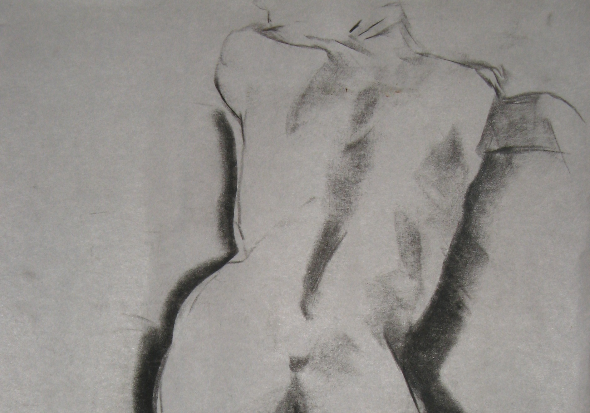
In fact, the third 7-minute pose yielded my favorite drawing of the morning:
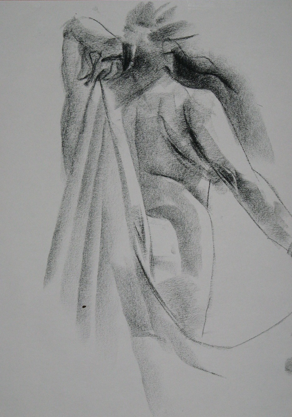
The light on the torso is what I loved most, and what came through. It was less successful on her right arm.
The poses got longer and if I was done and in danger of overworking something, or just dissatisfied, midway through, I flipped over the page and started a second one. So these two five-minute bits emerged from a 10- and 20-minute pose:

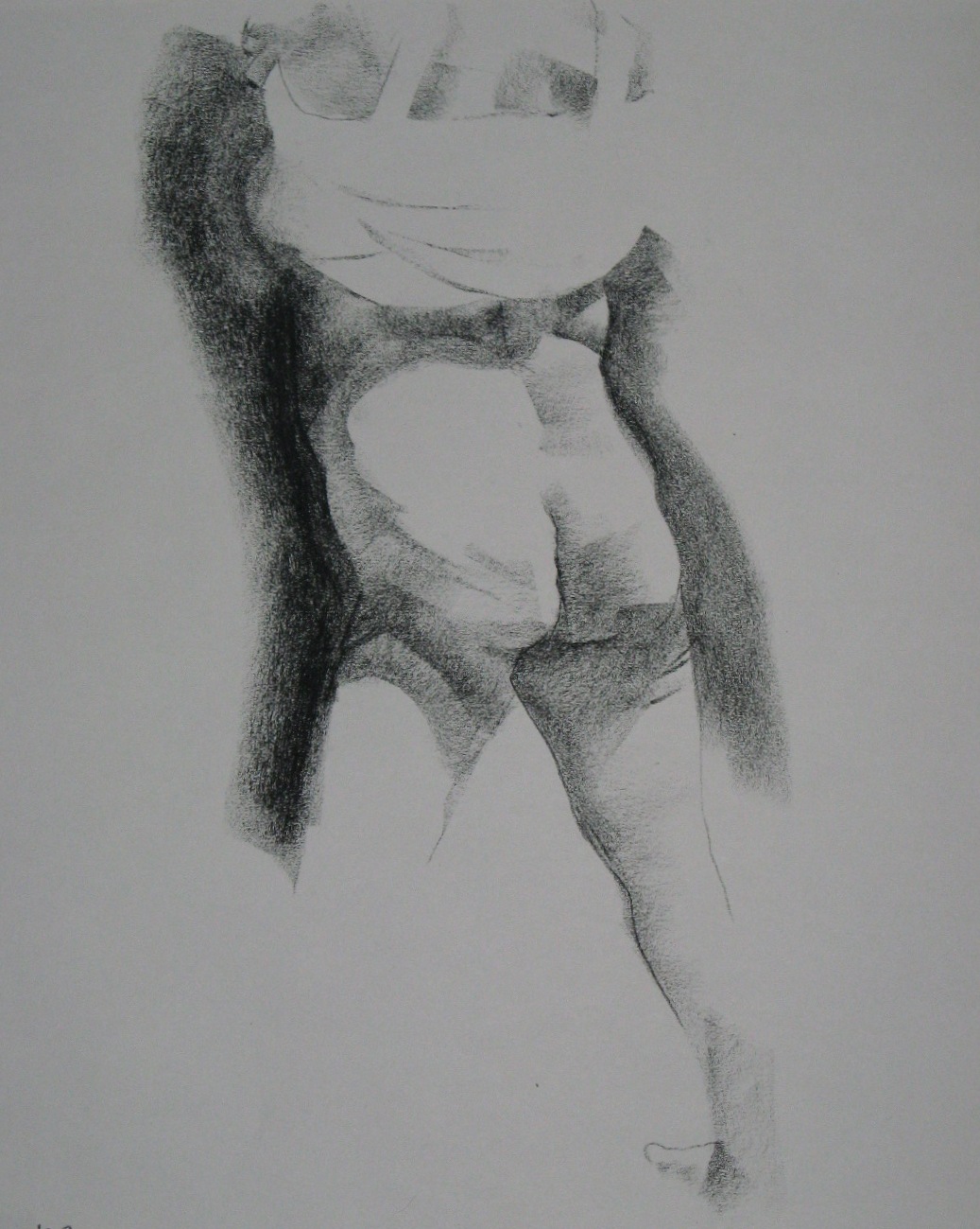
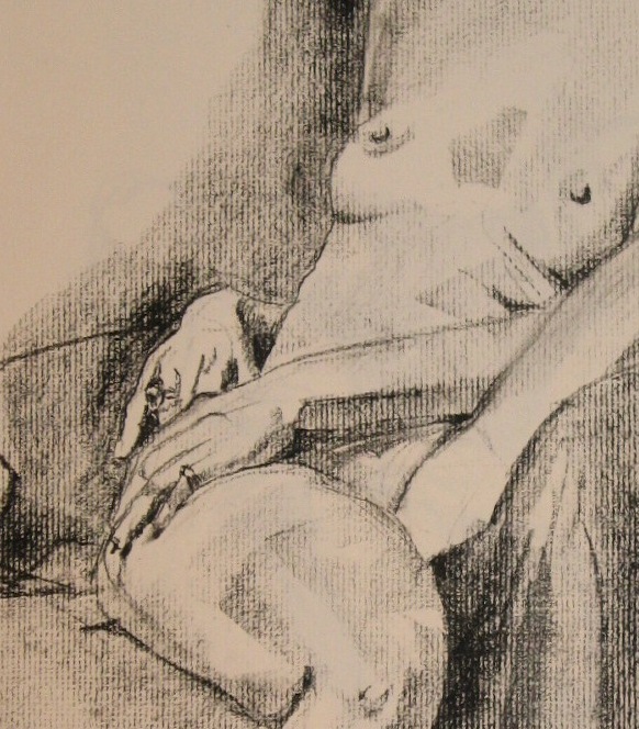
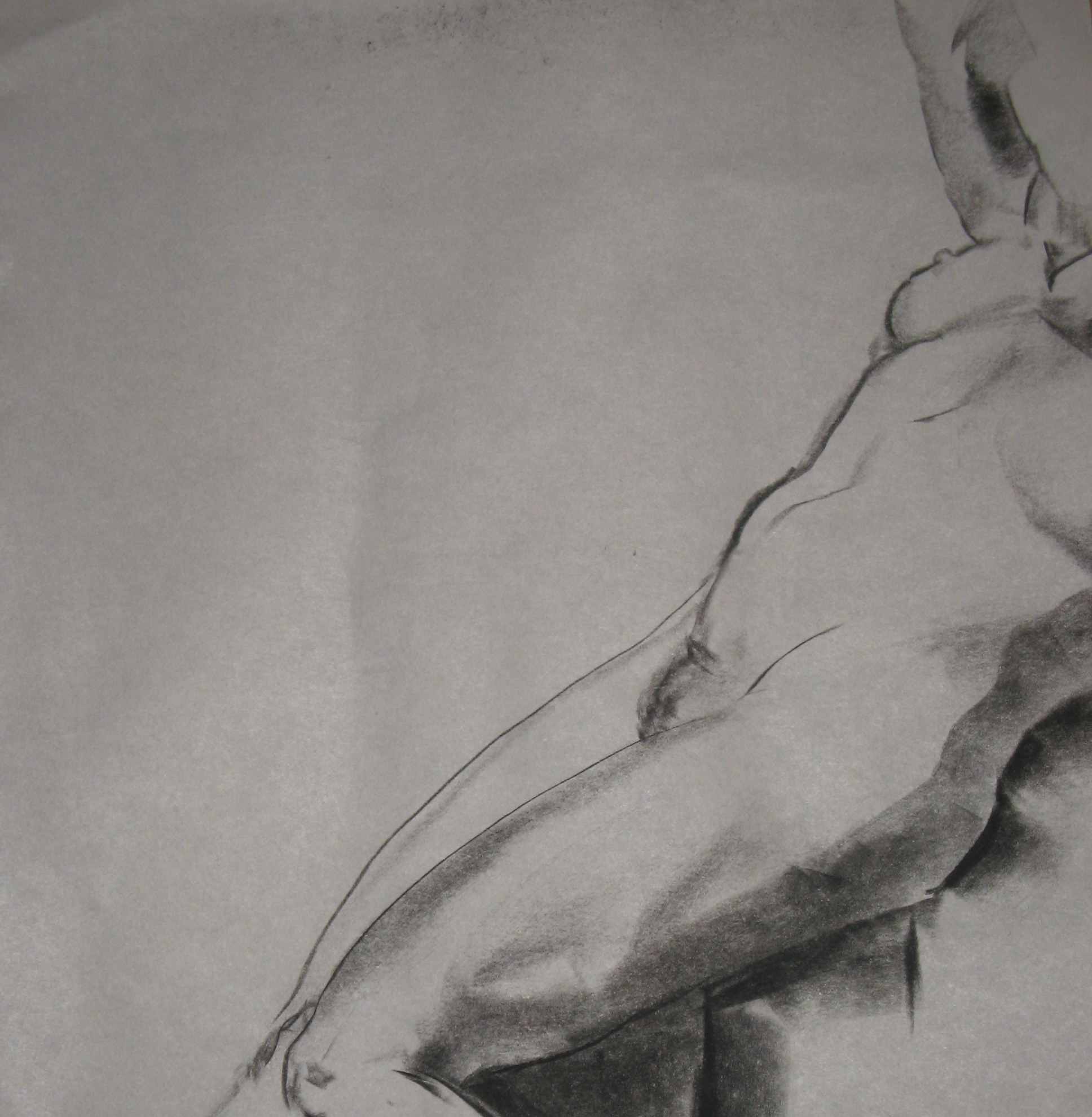
The vast expanses of back and belly, with their subtle shadings, are often beyond me. I put in too many marks or make them too dark, or else I back off entirely and the whole thing ends up flat. Yesterday I was able to evoke something of those slight changes in tone, like in the back on the first drawing, the belly in the second, and the arm here:
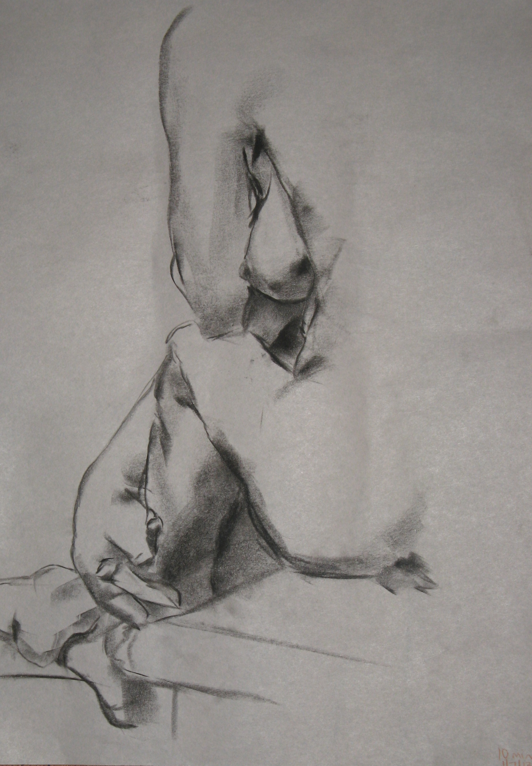
Three slightly longer poses. I was done with this next one after 15 minutes. I got the proportions wrong and made her too stocky–she’s actually very slim–but I wasn’t going to erase and fix it (almost impossible to do much of that on newsprint anyway). I was trying to keep my hand moving and focus on the light. Wherever I can see that light in the drawings, it makes me ecstatic. I never could understand the Impressionist obsession with evoking light, but I get it now. Though frankly, the Dutch masters’ success in this area left nothing to improve on, in my opinion.
In this next one the light ended up a little lurid. Not sure why. But it’s a sign of my erring on the side of boldness and high contrast, and that’s good.

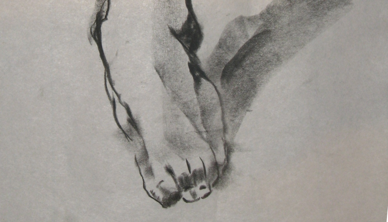
The wrinkles on the bottom of a foot are a puzzle to me. Maybe the next few times the pose makes them visible, I should focus entirely on them and see if I can figure it out. Other than that and whatever happened with the calf, and once again making her torso look wider than it is, I like this last one pretty well. The light works in several places.


Recent comments