
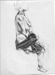
These are the only other three from last week that I like enough to post. On (e), the only really successful part was the hat, so I cropped it to that detail.
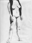
I’m pushing myself to go darker with the blacks, and the result is a kind of florid appearance that I dislike, as in (g) here. I’m trying to figure out what I did in the drawings where I went dark and had plenty of contrast but not that florid appearance. Why is (h), the one on the right, a success and (g), the one in the middle, is not?


Leave a comment
Comments feed for this article