You are currently browsing the category archive for the ‘art’ category.
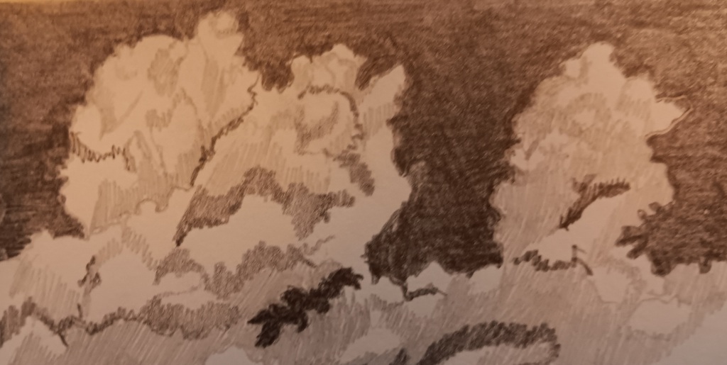
Two more drawings in my 4×6 sketchbook. Clouds in Geneva, making me wish that I had colored pencils with me.
And something inspired by Paul Klee, who was unafraid to incorporate signs such as arrows, numerals and letters, even stick figures if they served the vision. I would normally be cowed out of using arrows by the inner critic who sneers, “Kind of a shortcut, isn’t it? Don’t you have a way to show motion befitting an artist, or are you just a jumped-up road sign painter?” I tried to be more polite to my inner critic than he was being to me, kindly suggesting that it sounded like he had a bad headache and might want to go lie down. But I couldn’t resist pointing out to him that the great Paul Klee used arrows, and he was no sign painter. He went away grumbling.
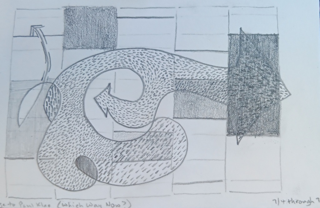
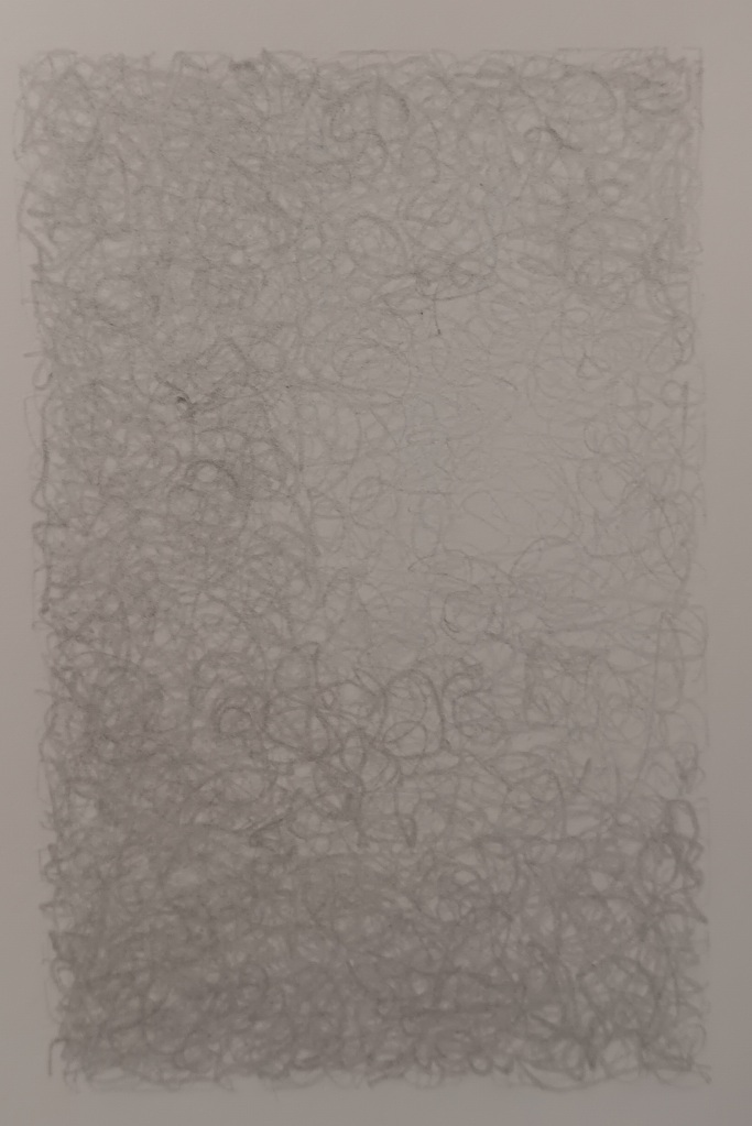
Both are graphite pencil on paper.
With time in the Zurich Hauptbanhof before our train to Geneva, we found a store (Flying Tiger,based in Copenhagen) that was like Daiso in the breadth and randomness of its merchandise, many items of which also had Daiso-like little quotes, but in disappointingly flawless English. Also, the packaging was quite uniform, as if everything were manufactured in one place instead of a dozen. There were snacks, including several types of marshmallows, making marshmallows about 50% of the foods on offer (maybe they are as popular in Zurich as Pocky are in SF?). There were kitchen gadgets. There were model traffic lights that really blinked. There were 2023-24 planners in French and German, making Munchkin slightly regret that she already bought her planner. There was a notebook that she opted not to buy despite the built-in calculator on the front cover (of course she doesn’t need a calculator, but she thought that was so cute), and a gel pen that I convinced her to get because she is constantly borrowing mine. I struck it lucky with my sketchbook search, finding one that is a bit heavier than the ideal, being hardcover, but irresistible at six Swiss francs. (I had looked in the museum stores in Zurich and Bern and would have had to pay 30 CHF for one with fewer pages. Yeesh.) (Another small source of annoyance in Switzerland: it isn’t in the EU–something I did not know until I arrived there, though it stands to reason–and so broke the streak of needing nothing but euros all summer. Everyone charges everything, so it made little difference. However, I’m glad to be back in the Eurozone and able to spend cash on small purchases again. I know “the convenience of tourists” was low on the list of concerns in the formation of the EU, but I sure do love the single currency.)
—–
Rereading: Gilead, Marilynne Robinson
Finished: Oil and Marble
Continuing: Understanding the Fundamentals of Music
A couple of sights recently made me want to try to create something like their luminosity. One was a circular reflection of light on a painted white wall, and the other was a painting I saw when Joy and I visited the museum Ca’ Pesaro yesterday. I thought I would remember the artist’s name, but I have already forgotten it and will have to do some research. I was so taken with how a simple use of line could create such a powerful sense of light and dark. An apt topic for the solstice.
I brought a very small sketchbook with me on this trip, and so these are very small drawings, each about 2″ x 3″. Graphite pencil. I hope the focus is adequate; I photographed them on a moving train (hello, Slovenia!).

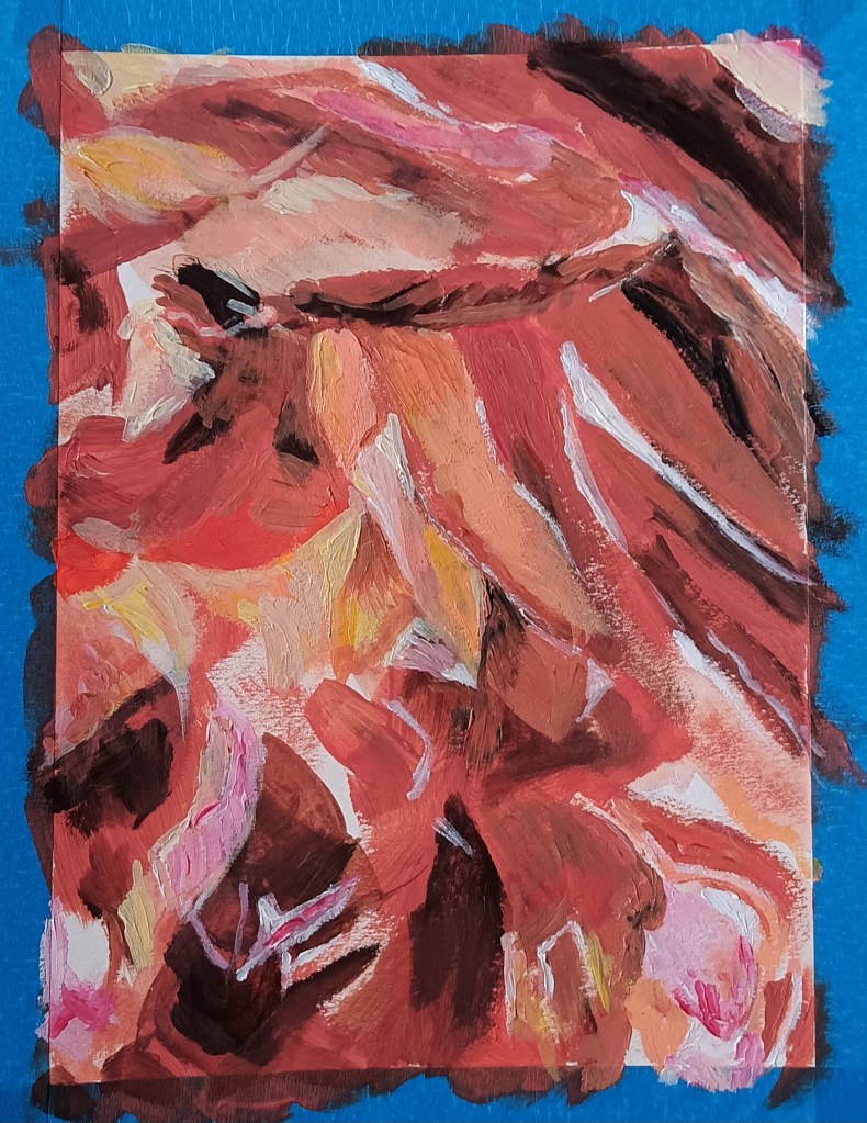
The moment I saw this picture, taken by my friend Nancy Palmer Jones, I said “I want to paint that!” Nancy said, “Go for it!” I want to document the stages, because it’s so heartening to remind myself how the painting went from blank to visual gobbledygook to “hey, that looks like something” to “that’s it!” So I’m putting the original photo at the end of this post, to show the painting getting closer to the model.
The painting is acrylic on paper, about 8×10″. I haven’t taken a painting class since high school, so for even the most basic questions, such as “Should I work from dark to light or light to dark or what?” I have to ask friends or Professor Internet. Professor Internet gave me a fairly consistent answer, but then I forgot what it was, and once I’m painting, I am too impatient and impulsive* to interrupt and go look again. So the first stage turned out to be me laying down blocks of color, mostly midrange, with some darks put in and the paper left blank for the lights. Here it is:
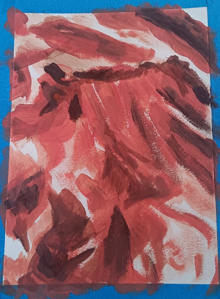
Today I was even more flummoxed about what to do next, feeling a bit like I was just coloring. I did not want to color. But my drawing instincts took over and I found myself doing what I would do with a pencil or charcoal, except with a brush. After today’s hour or so of my getting more specific with the lines, shapes, and colors, the piece kinda sorta looks like the petals of a rose:
I might not get back to it before leaving on our long trip, a week from today. I’ll bring a sketchbook and some pencils, of course, plus a few markers and colored pencils. Painting and other projects will resume when we’re home.
The original:

*Autocorrect tried to change this to “intuitive. ” Aw, thanks, Autocorrect!

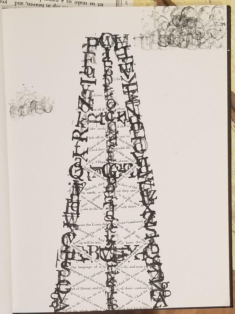
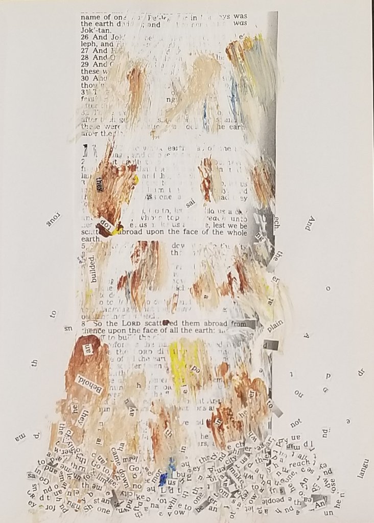
I’m not sure if this one is finished. I had envisioned many more fragments of words falling and heaped up, and I’m not sure if I paused here because it is done, or because I got tired of gluing tiny rectangles of paper. I’ll look at it afresh tomorrow and see.
Postscript : it wasn’t finished. See my next post.
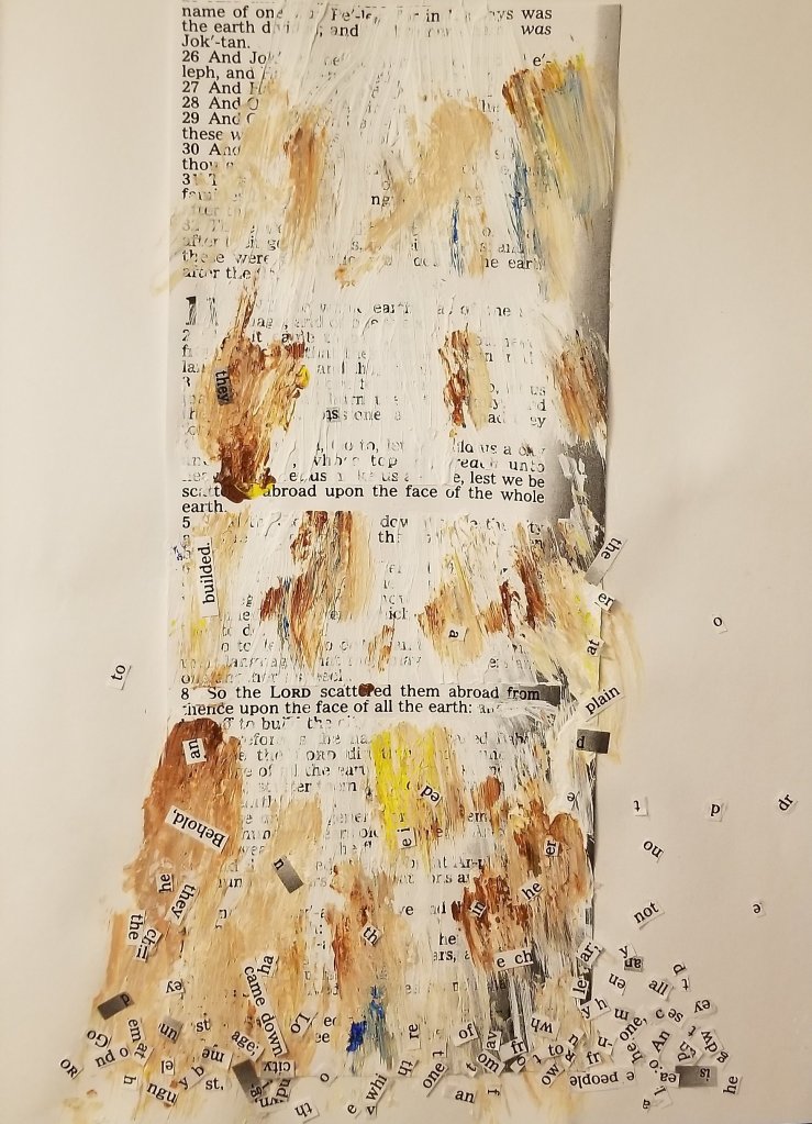
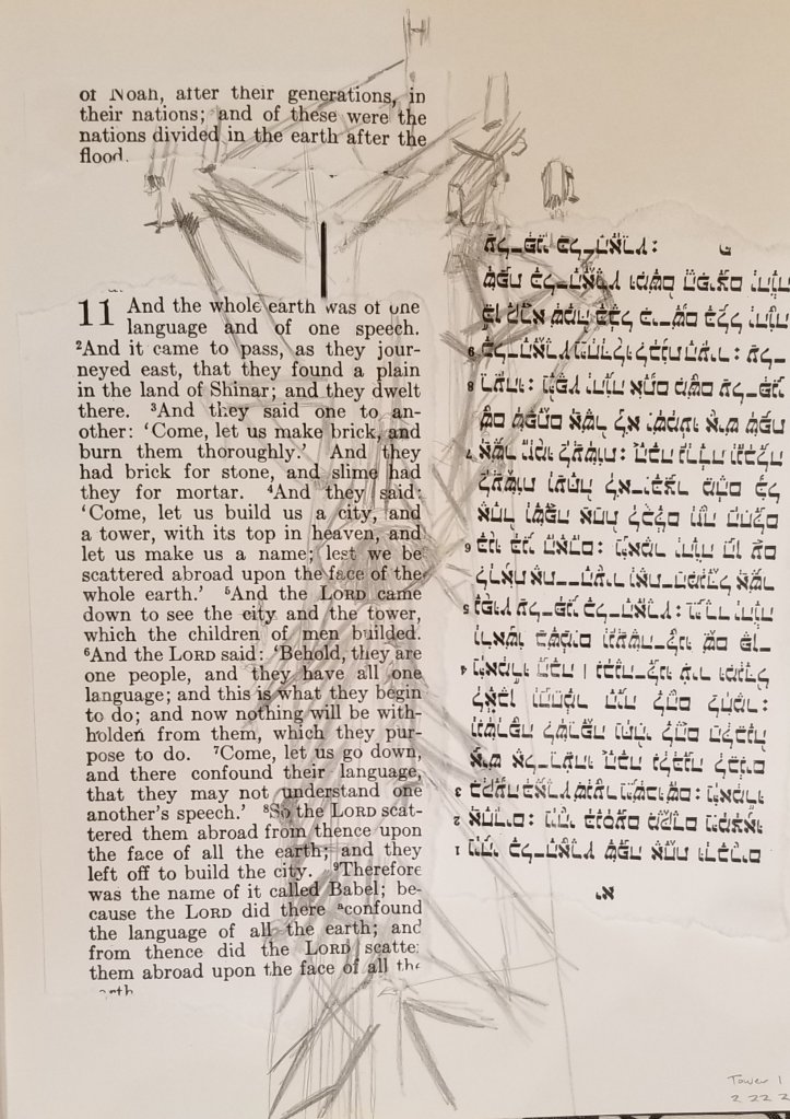
I’ve been intrigued by the Tower of Babel for a long time, so I’ve decided to really dig into it via art (and maybe writing) by making it my Lent project. Every day, an exploration of some aspect or interpretation or tangent of this very brief (nine verses, Genesis 11:1-9), enigmatic story. Here’s the first.


Recent comments